


Inside Moves

We live in a wonderful era of creative development in a variety of watershaping trades and are truly blessed, it seems, with an ever-expanding generation of talented artists and a sense that our most dynamic creations are yet to be built.
For all of this forward momentum, however, I find myself surprised and dismayed all too often by the lack of creativity that goes into our work below the water’s surface. To my eyes, pool and spa interiors in particular are simply bland and boring.
I’m oppressed by six-inch waterline tile surmounting a field of white, gray or black plaster – interrupted occasionally by a bland dolphin, starfish or beach ball. Yes, exposed aggregate surfaces have helped by adding subtle colors and textures to these interiors, but when you compare what’s happening in pools and spas to the range of materials, colors, textures, finishes and sheer energy applied to dry hardscapes, you see that the (perceived) options for watershape interiors are few in number.
In my own company, we’ve worked hard to increase the range of subsurface options for our customers, so much so that I’ve come to regard the interior surfaces of pool as the final and best frontier when it comes to features we offer our clients. Here and in future articles, I’ll share our approach to the design process and describe some specific techniques we employ to liven things up underwater – focusing this time on tile and mosaics.
THE EMPTY CANVAS
It’s time to take the blinders off and think about color, realism, dimension, style, snap, pizzazz and the emotional impact of pool and spa interiors.
In our business, we’ve found that turning our creative efforts in this direction has led to increased customer satisfaction, an enhanced portfolio, a stronger reputation, more referrals and a welcome improvement to the bottom line. Add to that the increased satisfaction that comes with creativity and the fashioning of something truly artistic and you can see why I believe that we have everything to gain from embracing decorative interior finishes.
In our work, it’s not at all unusual for a project to include interior features that exceed the cost of the watershape itself, often many times over. But it’s not all about being elaborate: In fact, in a great many projects I find that relatively small (and inexpensive) visual elements can become the most intriguing and attention-grabbing features of entire installations.

As is the case with many in the watershaping trades, I’ve come by my opinions and approaches through years of experience and experimentation. I now work all over the world, but the majority of my projects are still installed in my home state of Hawaii.
One thing I’ve learned for certain in my career is that tile is a popular favorite on the islands – and that it’s getting to be that way everywhere else. Through the years, I’ve installed nearly 200 all-tile interiors and do more of them every year. These days, in fact, more than 80 percent of the rehabs we do in Hawaii are all-tile, and almost all of the projects I do here and abroad include at least some use of decorative tile that goes beyond the traditional waterline band.
Along the way, I’ve sold and installed murals ranging from simple square or round crests or logos that cost just a few thousand dollars to huge and elaborate three-dimensional coral reefs that check in at several hundred dollars per square foot – and jobs of every type and extent in between those extremes. No matter the project, I’ve found that the key to persuading clients to share your vision and commission the work is the direct result of your spirit, attitude and approach.
In other words, it’s not so much about the budget or the style or the setting; rather, it’s about how all those factors fit together and how you look at the potential of a project and convey that potential to the client.
START WITH ART
In approaching my clients, I never lose sight of the fact that my ambition is to create and present to them something that will be viewed as a beautiful, valued and enduring work of art, a one-of-a-kind masterpiece. To be sure, not all watershapers are artists at that level, but I’ve learned through the years that you can find someone with the talent if you look in the right places, whether it’s within your family or organization or from an outside source.
In some situations, the clients themselves will provide artwork that I translate for use on an interior. Some of the source material isn’t to my taste, and I sometimes get chills thinking about children’s artworks I’ve been asked to use to “inspire” a design, but the truth of the matter is that there’s no better way to stroke a client’s ego than to immortalize his or her own design (or little Jenny’s artwork) in the bottom of a pool.
This is a roundabout way of reaching a key point: All of what I’m discussing flows from getting the clients involved in the process. You have to discover what they like and determine their favorite colors, shapes, textures and images. You need to ask about their favorite flowers and animals and find out what sorts of scenery or architectural styles pique their interest.

In Hawaii, for example, the strong Japanese influence means that designs featuring Koi are particularly popular, as are those with flowers and undersea creatures and scenery. While it’s useful to keep these sorts of generalizations about popular tastes in mind to open your discussions, it’s important to remember that everyone you meet brings unique tastes and preferences to the process. My job, as I see it, is to use popular themes and images as a point of departure for creating a work that will inspire and delight my clients.
Once you tap into your clients as a source for ideas, you’ll find that there are infinite design directions and concepts you can develop. As you elevate your skills and reputation and put yourself in a position where you can approach the custom market, you’ll find a wonderful clientele with budgets that allow you to be extremely creative.
That’s always wonderful, but it’s also true that most people, even the truly affluent, will introduce some level of budgetary constraint to the process. Fortunately, there are many fairly simple and relatively inexpensive design ideas that can yield tremendous results.
FRAME BY FRAME
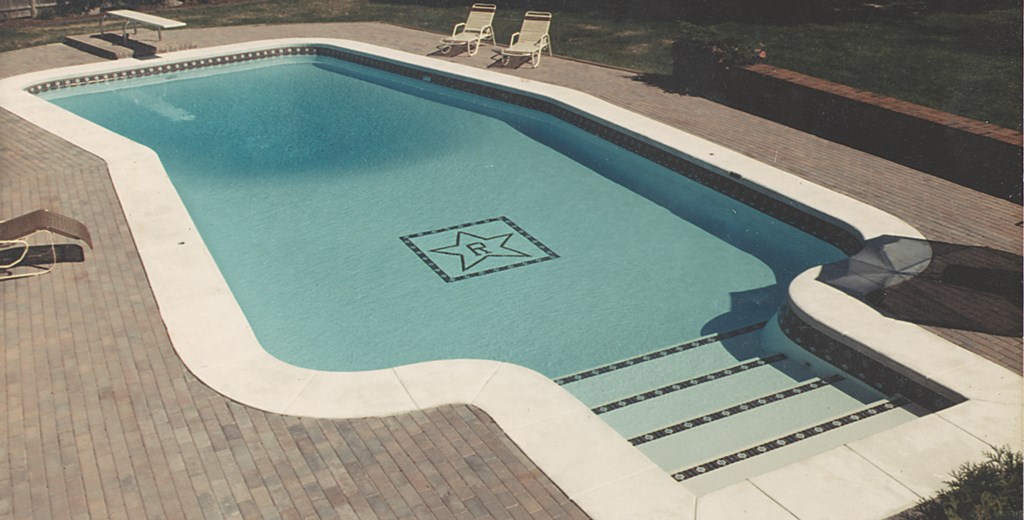
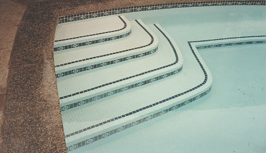
Let’s get specific with one of my favorite types of project upgrades: Take a rectangular pool, approximately 15 by 30 feet, either brand-new or with some years on it. Say it has six-inch waterline tile of any color and standard white plaster.
|
Tile Points Working with any tile – and especially with the highly decorative material described in the accompanying article – it’s crucial to pay close attention to material and precise installation techniques. Here’s a punchlist of key considerations: [ ] Know the codes. Before designing or installing anything, you need to familiarize yourself with local health and building department rules – and follow them well, if only to avoid liability issues. [ ] Always try to create a tile-ready surface that is as flat as possible. A perfectly flat srface helps you avoid the appearance of shadows, especially at night when the lights are on. In addition, a tile mural or logo will be much more striking and can take on an amazing shimmer if it is truly flat. So unless you’re working to achieve an embossed or textured effect, flat is the way to go visually – and prevents foot hazards within the pool. [ ] Be careful with your setting material. You want enough to fix the tile in place, but you don’t want the material oozing up into your grout joints. [ ] Always use a setting material that is as close to the color of your grout as possible. This hides small imperfections and helps the work keep up a great appearance for as long as possible. [ ] Place the setting material on a properly prepared mortar bed. An acrylic-modified thinset works best for most applications, especially when paired with a sanded, acrylic-modified grout. [ ] Don’t cut corners on materials. Charge enough so that you can use the best products available. [ ] Always, always read and follow manufactures mixing instructions for the mortar bed, the setting layer and the grout. [ ] Make good cuts. In cutting tile, I use a standard 12-inch tile-cutting board along with side-cut nippers and a Makita-type four-inch angle grinder with a non-segmented, dry-cut diamond blade. [ ] As a time saver, work at developing a photographic memory. I’ll look at a gap and picture the tile that will fit, then go and make the cut to comply with the mental image. [ ] Always take the time to make sure grout joints are consistent. Too many times, I’ve seen fairly good jobs of laying a lot of tile ruined by inferior grouting. [ ] Keep the surfaces properly hydrated and don’t let the tiled area get too hot as the materials set.As a last graphical point, I almost always use a staggered-joint pattern for large areas or for the field. If I start to “catch up” in areas – which always happens – I’ll throw in a smaller piece keep to throw things off line. It takes extra time, which is why some installers don’t do it, but I think it’s worth the extra effort. Frankly, I have an ulterior motive in working with staggered rather than running joints. The former let me make fine adjustments with ease, while the latter, I think, can look contrived – and tends to magnify even the slightest mistakes or inconsistencies. Most people don’t pick these imperfections up visually, but I certainly do. I figure that if I can spot these little areas, someone else can, too. So what’s a cut or two if it can make or break the visual appearance of your work? — G.H. |
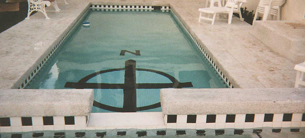
If I’m faced with a client looking for a reasonably priced visual upgrade as part of a renovation project, I might suggest installing a six- to eight-foot square or circle as a mosaic in the floor of the shallow end to be made up of one-by-one-inch glazed tile. That mosaic might be some sort of illustration or even a simple geometric pattern.
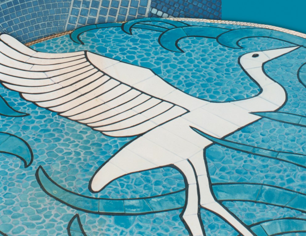
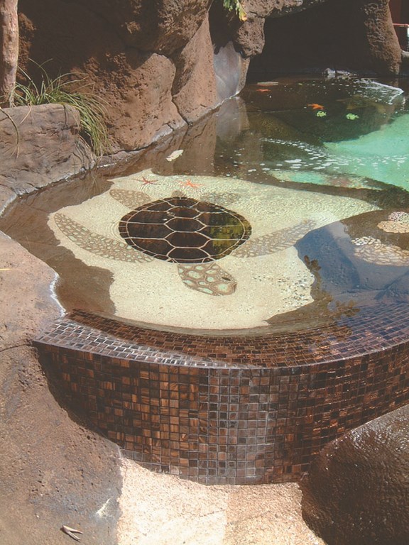
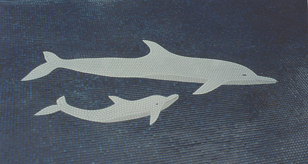
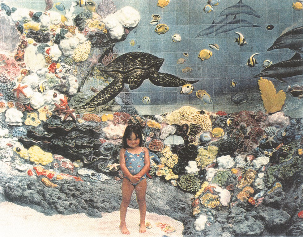
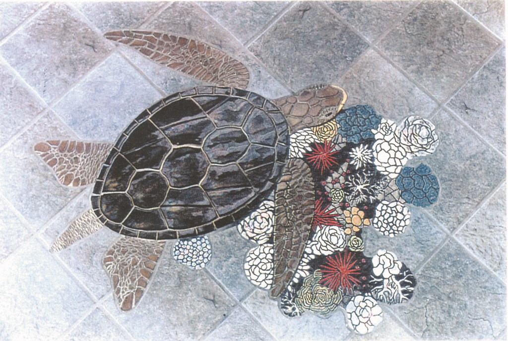
I most always recommend framing a scene with a definite tile border so that everything on the inside and outside will finish to it. This creates a visual marker that calls attention to the art and can be used to blend the artwork with other visual elements in the waterline tile, decking or even landscaping. You might do something fairly traditional, such as set a couple of turtles, dolphins or flowers inside the frame, or you reach for an abstract image or a realistic mountain scene – or anything else your clients desire.
To create more depth and dimension, think about overlapping the visual elements, perhaps by allowing part of the design to extend beyond the border – a dolphin’s tail or nose or a single petal of one flower. Think as well about using darker tile to create shadow effects and add dimension, especially with mosaics. You can purchase ready-made mosaics from a number of sources and just wrap your frame around it, or you can create patchworks of broken tiles to achieve wonderfully rich looks.
The only time I don’t recommend framing is with a mural of a company logo, say, or when I’m working with a design that’s big enough to stand on its own.
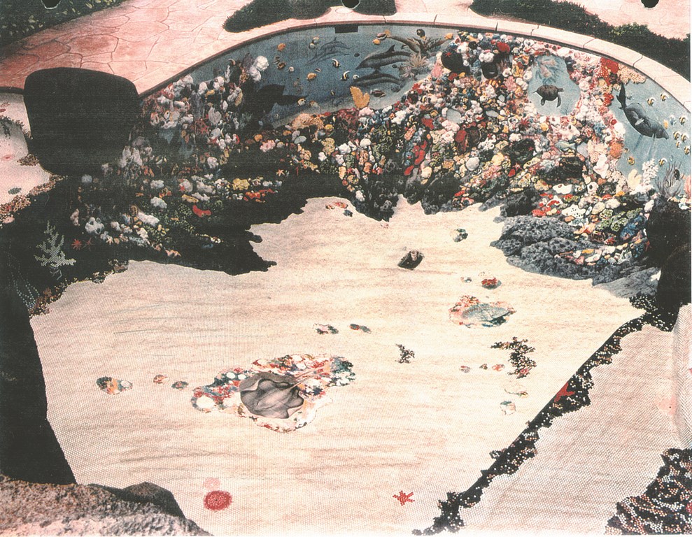
I also stay away from frames when the client wants a number of visual features on the vessel’s interior. As a rule, I’ve found that frames work best when they cover a single area of a pool or spa. Beyond that, I’d rather reach for a completely illustrated pool than set up three or four items scattered over a broad area: The isolated features tend to get lost, look cheap and, most important, seem incomplete. In other words, keep it simple – or run to the opposite extreme and install an entire coral reef or big schools of fish or multiple flowers and leaves.
Within a frame, you can fill out the spaces around the artwork with tile or plaster. This offers another opportunity to add contrasting or complementary colors – or you may want to pick up the color of the frame.
If you use cobalt one-by-one-inch tiles in framing dolphins with light blue bodies and white and gray bellies, for example, you might use black tile to create a shadow effect around part of the dolphins to give them a “raised off the bottom” appearance. You might then fill in the spaces around the dolphins and within the frame with the same cobalt tile or another colored tile, or you could use colored plaster. Even if you are plastering the pool white, the cobalt of the tile frame and the colors of the dolphins set up enough color contrast that even filling in the space with white plaster will look good.
LIVING ELEMENTS
I don’t see my work on interior-surface designs as being different from any other part of the watershape design process. As a result, I’m always evaluating possibilities with respect to color, contrast, balance, context, size and a proper location in the pool for the artwork – all fairly basic, but important nonetheless.
Context, however, is particularly crucial, which means your thinking needs to encompass the colors of the waterline tile, plaster, decking and home exterior as well as the shape of the pool. (I’ve found that round designs can look good in square pools, for example, but that square designs don’t work so well in round pools.) Look for themes you can exploit or visual motifs in the style of the home.
Just as important as context is proper proportion. You don’t want a mural that overpowers the rest of the project’s features: The entire watershape, interior and exterior features combined, must complement its surroundings, which means you must strive to blend your interior visual elements with the overall design with respect to style, color, size, texture and visual impact.
As you work, bear in mind that traditional visuals such as dolphins, turtles and whales don’t add a great deal of striking color with their often-muted blues, grays, browns, greens and whites. Flowers, art deco figures or contemporary art, by contrast, all allow you to select much more vivid colors. Hibiscus, plumeria (or frangipani), orchids and birds of paradise all have spectacular colors in their blooms, and I’ve found that their stems and leaves can be beautiful as well.


When planning these effects, it’s always wise to check in with local suppliers and find out what colors they have available: It’s never a good idea to get clients excited about pink flamingoes, for example, if you can’t get your hands on the right pink tile within the scope of your project timeline.
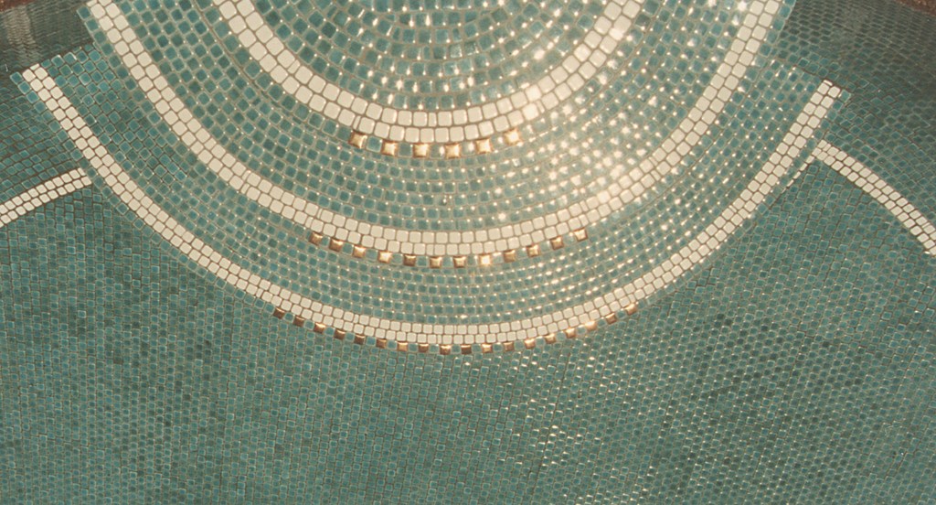
As you prepare for your work on site, you should always think your designs through in great detail and draw them out in paint-by-numbers style, including the border and any field tiles that might surround a key visual feature. There’s an art to tile layout that eludes many designers and installers: If, for example, you use the right “flow” of tile, you can actually give the appearance of movement once the pool is full and the element of water refraction is introduced.
This leads to another important point: As a designer, you need to know that once the water is added to the vessel, things on the bottom will look smaller and some detail may be lost.
OPENING UP
As I’ve developed and expanded my decorative approach to interior surfaces, I’ve learned to treat every project as a new and unique adventure.
|
Inch by Inch I start with one-by-one-inch glazed ceramic tile for a great many of my projects. It generally comes in square-foot sheets with a mesh backing, which I like as a time saver. Many of these tiles have slightly rounded corners, which is great for setting up the sort of sweeping curves I work with in setting up frames. In these cases, I usually cut the sheets lengthwise into individual one-inch strips. I’ll also use coin tile in developing coral reefs or floral patterns, but I’m cautious in doing so because the coins can leave you with some large and potentially unsightly grout gaps. — G.H. |
I get creative in the process of listening to my clients and working with them to execute their ideas. I’ve also seen what can happen when clients are introduced to the broad set of decorative possibilities available to them and get excited by ideas they’d never considered before.
This give and take is what makes the work of building custom watershapes so satisfying. I see interior designs as one element in the broad spectrum of visual possibilities, but it’s a truly exciting one because it gets so little mainstream attention. So start off small if you like: The important point to remember is that as you get more and more involved with what’s happening below the waterline, you’ll find an entire canvas you can fill with detail, color and delight.
Glenn Harris is founder and general manager of World Class Pools by Harris, a designer and builder of high-end custom pools with operations in Honolulu, Orlando and Tokyo. Harris has been involved in pool construction through almost his entire life, beginning his career at the age of five alongside his father, Charles, who is said to have been the first person to receive a swimming pool contractor’s license in the state of California in 1957. Although well versed in all phases of construction, from excavation, steel and plumbing to gunite, shotcrete and even hand-packed shells, Harris now focuses primarily on cosmetic details, including tile, plaster, decking, and both natural and artificial rockwork.