


Finding the Look

Not long ago, I was asked by a reporter from The New York Times to define the main difference between swimming pools now compared to what they were 20 years ago. As we talked, it became clear that she was mostly thinking about technological breakthroughs in pumps and chemical treatments and the like.
I confirmed for her that, yes, those products had come a long way. But I wouldn’t let her stop there, suggesting that there was much more than a run of technical advancements behind the explosion of interest in watershapes in the recent decades.
What we’ve also been seeing, I said, is a latter-day Renaissance of interest in classical notions of
truth and beauty and a renewed focus on artistic media and performance. It’s less about pump curves and advances in automation, I said, and more about Aphrodite, Apollo, Athena and Aristotle – what I see as the A-list behind a new perception of pools and other watershapes as true, inspired works of art rather than utilitarian watering holes.
As stuffy and erudite as that might sound, what I wanted her to understand was pretty simple: At the industry’s leading edge, designers and builders around the world have awakened to the fact that, at its best, our output as watershapers makes profound, meaningful and unique artistic statements.
Now, as we shift our attention in this series of columns from rough construction to finishing touches, let’s start by looking at stone and tile and what it takes to establish great interior finishes for watershapes.
LOOKING BACK
While speaking with the reporter, I beat what should be a familiar drum to readers of this column – that is, all watershapes exist in a greater context of which they should be no more than component parts subordinate to and harmonized with the setting, the architecture of the home (or surrounding structures) and the desires of the clients.
When a watershape works in that way (whether it’s a stand-alone piece of art or a minor accent), it becomes something very special. The key to watershaping’s evolution in the past 20 years – and the subtext for the reporter’s questions – has to do with the fact that an increasing numbers of designers and builders are operating on a higher plane where design and construction can and do indeed become art.
As with the Greek, Roman, Moorish and High Renaissance cultures before us, we’ve awakened to the timeless, mesmerizing beauty of great materials and are now applying them in our projects as never before. I told her about beautiful stone, colorful aggregates, pristine plaster and, as we’ll discuss just below, fantastic tile – the raw stuff of centuries of great design.
In fact, some of the best examples I’ve seen of the use of stone in watershaping reach back more than 2,000 years.
In the ancient eastern Mediterranean city of Sardis, for example, you see spectacular reflecting pools left to us by the Greeks and Romans – vessels lined with travertine, marble, granite and other beautiful stone species. Those who built these pools used these materials to paint surfaces: When the pools held water, the stones’ natural colors and textures and startling depth became apparent for all to see. Now dry and their colors muted, these pools still make fantastic visual impressions.
Stone is, of course, a natural material and is often cold in appearance. This is why so many of today’s designers use it in sleek, contemporary designs: Where Black Absolute Granite generally seems out of place in the context of a Craftsman- or Ranch-style home, it’s right where it belongs next to a sharply geometric home wrapped in big sheets of glass.
If you want warmth and/or bolder colors in watershape finishes, you generally need to look beyond stone. This is why I’ve always loved working with tile: The variety of these products available today is incredibly vast, from marvelous ceramic/vitreous tiles to a stunning array of glass products that are, I am unashamed to admit, my favorite choices of all.
ARTISTIC PERSPECTIVES
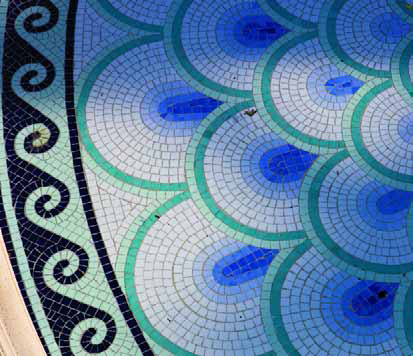
Whether you’re working in mosaic forms or creating sweeping visual fields, tile can be heartbreakingly beautiful and jewel-like. In my humble opinion, it’s through the creative use of these materials that today’s watershaping comes closest to being favorably comparable to the work of the ancients.
A closer and more relevant comparison for me, however, is to the work of the Impressionist painters of the 19th Century who showed the world that singular color impressions can be generated through use of many colors in the forms of dots (in the case of Seurat) or smudges (as with Monet). Spinning off their approaches, I’ve found it possible to make tile into a true artistic medium that reaches well beyond the familiar realm of mosaics.

| Echoing the pointillism of Georges Seurat, a well-selected mix of glass tiles of different colors and opacities can create watershape surfaces that come alive when sunlight hits them. The visual depth and texture of these finishes – with glass tiles from Boyce & Bean on the left and Sicis on the right – is, I think, unmatched in design terms and explains why I keep coming back for more. |
 Returning to the question from the Times’ reporter, the emergence of tile as an interior finish is one element that truly separates watershapes of today from their not-too-distant forbears.
It’s also a feature, by the way, that distinguishes truly custom work from the more pedestrian efforts of volume- or production-oriented firms. In my case, I’ve never been one to accept off-the-shelf design solutions and choose instead to apply my extensive background and training in color theory in my projects whenever and wherever I can.
It upsets me when I hear about watershapers who have clients select tile in visual isolation, as though it would never have a context in a pool. A good decision requires consideration of the tile in relation to the pool’s interior finish and the color of the coping and deck material beyond the waterline. It just doesn’t “work” otherwise!
Indeed, tile chosen in isolation may be pretty and even very expensive, but it is often completely inappropriate: I can think of nothing less satisfying than having friends visit and say “Wow! That tile looks great!” when what you really want them to appreciate is the overall setting and how everything works together to make an overall visual impression.
This is why I’ve said many times in the past that blue is usually the wrong choice for waterline tile. It doesn’t work with green, gray, black or white plaster (in fact, those colors make the tile stand out line a beacon), and it gets even worse when that band is topped by the usual red-brick coping: It’s a color-sensitive person’s worst nightmare!
AVOIDING DISRUPTION
I’ve always believed that a designer who strives for quality and real beauty needs to look beyond the trite answers – and that includes developing waterline solutions that take the interior finish and the coping/decking materials into account. If the tile selection is made in any other way, clients are being done a great disservice.
The result of taking the easy way out is that you end up with three or even four different materials drawing attention to the point where the water transitions to the surrounding environment. Not only is this ugly, but it also highlights the shape of the vessel in such a way that it can only make the watershape a separate, glaring visual element within the setting no matter how much the designer or builder might have wanted it to seem harmoniously integrated into the environment.
This is no knock on today’s ceramic tiles, which can be absolutely wonderful. Nor is it a blanket indictment of what was available 20 years ago, because some of those products were used to great effect by thoughtful designers and builders. My issue with past practices (and with people who persist in being careless with tile to this day) is that the material often wasn’t (and isn’t) used effectively.
The Impressionists knew the secret – that each color impression can be made up of many other colors. What I always try to do in my work is apply the lessons they offer by developing blends from many different tile colors and using them literally to paint a pool’s surfaces.
Through experience, I’ve found that the glass tiles made by Sicis of Ravenna, Italy (which is distributed across the United States by Cactus Stone & Tile of Phoenix, Ariz.), are just right. At five-eighths of an inch square, they are small enough to create the stippled effect I’m after and come in such a broad array of colors, textures and surface treatments – opaque, iridescent and translucent – that I can achieve just about any visual effect I want.
Let me be clear: There’s nothing wrong with combining, say, plaster with tile at the waterline so long as that tile “works” with that interior finish as well as the decking and/or coping material. Heck, I use this combination of details all the time – but when I do, I always use colors that blend well and enable me to create seamless transitions from material to material. In these cases, the “traditional” approach can be used to create an elegant look that fosters continuity rather than visual separation and disruption.
HIGH ASPIRATIONS
As in most such things, quality naturally counts when it comes to ceramic waterline tile.
Happily, the range of products now available is truly astonishing, and it doesn’t take much hunting to find great tiles ranging from the bold to the neutral in appearance. There are wonderful patterned tiles, including revivals of the approaches and textures used at the start of the last century as well as richly textured tiles from contemporary providers such as Craig Bragdy Design (Denbigh, Wales). There are also great hand-made tiles from my friends at Busby Gilbert Custom Tile (Van Nuys, Calif.). I happen to work extensively with those two vendors, but they are definitely not alone in offering watershapers great tiles for huge ranges of applications.
| Ceramic tile is often used to brilliant effect in watershapes, but the potential for success is greatly enhanced if you work with the best-available materials (with, for example, tile from Craig Bragdy Design on the left or Busby-Gilbert Custom Tile on the right) and stay away from the cheap, visually lifeless alternatives. Not only does this give you a fantastic array of options, but it also allows the materials to reflect your best aspirations to do quality work. |
 If I have a pointed suggestion to offer, it would be to avoid the cheap, mass-produced tiles that serve as a shortcut for too many watershapers. Yes, it takes time and effort to find the right tiles and inform your clients about them, but the easy path in this case leads to inferior, predictable, hackneyed results – the antithesis of beauty and “art.”
That said, there are also some fine mass-produced tiles. For example, I frequently use American Olean’s one-inch-by-one-inch porcelain tile (from Dal-Tile in Dallas, Texas) to great effect. Here, mass production is actually an asset, because I can rely on the consistent coloration of the tile to make waterline tile disappear in visual terms.
And I make no bones about the fact that, no matter which tile you use, it is important to have these selections in mind before construction begins: You need to know the dimensions of the tile you’ll be working with to set the interior dimensions of the shell, with the use of only uncut, full-size pieces as a goal.
And who’s to say that those tiles need to be six-inch squares? Why not use eight-inch pieces, or 12 or 16? Why not consider rectangular options as well? The point is, you need to know this configuration, whatever it is, and factor it into the specific dimensions of the watershape if you are to be able to install the tile without visual disruptions.
That need for precision is multiplied dramatically in the event you’ll be lining the entire interior of the vessel in tile. As I’ve discussed many times in past issues, there’s an art to laying out fields of tile, but if the vessel isn’t set up and contoured properly to allow that art to unfold, the opportunities for visual disruption will spin out of control.
VISUAL MAGIC
I am passionate about great ceramic tile, but as I mentioned above, I’m extremely passionate when it comes to great glass tile. It’s certainly not the only option I use, but the more I’ve worked with these products through the years, the more devoted I’ve become to them – so much so that I’m taking my involvement with these materials to an all new level. (See the sidebar below for more on that point.)
As with ceramic tile (not to mention stone, exposed aggregates or plaster), there are far too many great suppliers of glass tile to mention them all here. I’ve worked with a great many of them in the course of my career and in these pages have mentioned many who’ve won my admiration. It’s a rich universe, and I advise anyone who’s interested to be tireless in exploring the full spectrum of glass tiles now available.
|
A Position of Advocacy Let me start this by saying I’m not your typical pool guy: I have training and education in architecture, color theory and industrial design and owe my success to effective use of the skills I’ve acquired in a lifetime of study. Given my belief in and long experience with glass tile as an artistic medium, I’m now entering an arrangement in which I’ll be working with this material on a more extensive basis than ever before and am pleased to announce that I’ve joined forces with the staff at Cactus Stone & Tile (Phoenix, Ariz.) in offering my expertise in creating glass-tile blends to designers and builders across the country – free of charge. Through the years, it seems I’ve impressed the management at Cactus Stone & Tile with the color blends I’ve requested for use in my projects. Not long ago, Kirk Butler (the owner) and Ron Steadman (the marketing director) asked me if I’d be willing to share what I know about color and tile blending with the industry at large. I’ve worked with the company for several years in their capacity as U.S. representatives for Sicis (Ravenna, Italy), but they also distribute a range of other finish products that will give me latitude to draw on just about whatever I need to create effective blends for projects of various types and styles. And the best part of it is that Cactus Stone & Tile will be subsidizing the service and offering it free with orders that exceed a certain minimum size. This new enterprise, which the company will be calling Blended Colors, has me very excited not only because I’ll be working with a great team but will also be in a position to help spread the use of beautiful glass-tile materials well beyond the markets I serve in my own design/construction business. In addition, it will give me the opportunity to apply my knowledge of color theory and visual design to help others become comfortable with these wonderful products, helping them bring their clients the same sort of beauty that the Greeks and Romans enjoyed so many generations ago. This is a true labor of love for me, and I look forward to helping other watershapers develop truly custom blends that push what we do further along the road to quality and artistry. — D.T. |
In my case, this process of discovery has led me to focus mainly on the products of two key suppliers – Sicis and Boyce & Bean (Oceanside, Calif.) – whose palettes consistently inspire both my clients and me. If I were to describe myself as an artist working on canvas, these would be my paints.
Again, let me be clear: With glass tile, you almost cannot go wrong with established, reputable suppliers – companies of the sort whose products are often featured in this magazine. In fact, getting back to the reporter’s question for a moment, if I had to isolate a single material in which the emergence of fine, capable suppliers has been a force of change in the past decade, it must be glass tile. It’s a rich field that rewards those who keep their eyes open.
Sicis, for example, makes utterly beautiful products that exemplify the range of what’s available these days by virtue of the fact that they offer their glass tiles in four distinct styles. Their Smalto, Iridium, Glimmer and Waterglass lines come with iridescent, opaque and translucent finishes, and I’ve fallen in love with all of them because I can develop blends both within and between those lines. This gives me incredible flexibility with respect to color, depth, reflectivity and visual complexity.
Using these products (and others), you can conjure the visual effects you see in diamonds, emeralds, sapphires and rubies beneath the water when the light source is opposite the viewer. When the light source is behind the viewer, you get an effect that’s basically like the painting technique known as “pointillism,” where individual tiles blend together to create stunning visual fields and remarkable color impressions.
When I blend these tiles, I like to mix various blacks, whites and blues along with reds, greens and yellows in all their opaque, translucent, iridescent and transparent forms. When you add water with its complex reflections and refractions, some of these blends become objects of almost indescribable beauty.
PRACTICALITIES
As with ceramic tile, a good bit of pre-installation and, indeed, pre-construction thought must go into vessels in which glass tile will eventually be installed – especially if the entire interior surface is to be covered.
In these cases, it’s important for the shotcrete crew to know the precise dimensions you’re after so they can cut, trim and contour the newly applied concrete to best effect. Then, it’s vital to follow their activities up with skilled glass-tile installers who know how important it is to apply the proper substrate and float to make the surfaces to which the tile will be applied absolutely straight and true.
This will help you avoid the pitfalls that can wreck the visual continuity of what can and should be a stunningly beautiful interior finish. It’s a zero-tolerance exercise: Any bulges or depressions in walls, for example – flaws that are fairly well masked by a plaster or exposed-aggregate finish – will stand out like sore thumbs in all-glass finishes. That is simply not acceptable!
If you figure all this out and reach the level where you’re asked to apply these beautiful materials to the best of your ability, you have in some measure “arrived” as a watershaper. But it’s also at this point where you should already have begun to accept the fact that quality is something that is always considered from the start: The only way to ensure good results with beautiful materials is to prepare for their application from a project’s first stages!
Next time, we’ll look at some other interior watershape finishes and details.
David Tisherman is the principal in two design/construction firms: David Tisherman’s Visuals of Manhattan Beach, Calif., and Liquid Design of Cherry Hill, N.J. He can be reached at tisherman@verizon.net. He is also an instructor for Artistic Resources & Training (ART); for information on ART’s classes, visit www.theartofwater.com.