The New American Garden
The Chicago Botanic Garden is located, oddly enough, a good 40 miles from that city in the suburb of Glencoe, Ill. And although it is specifically named for the Midwest’s greatest city and might seem a municipal endeavor, it is actually maintained by private donations and serves to display the entire region’s rich flora and scenic beauty.
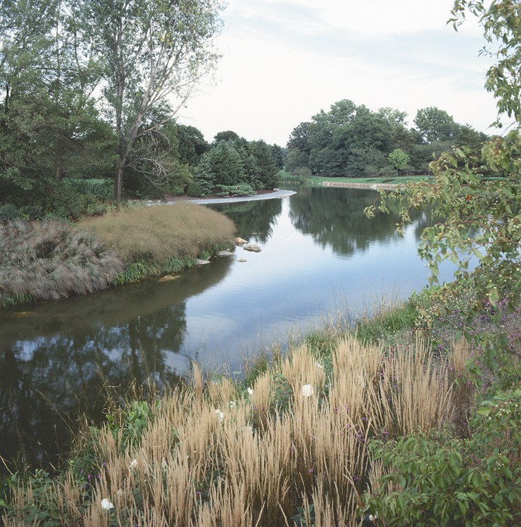
The garden is organized around a large body of water known as the Great Basin, which was created some 60 years ago by dredging the area and diverting the Skokie River to create a series of islands and lagoons. The largest island, known as Evening Island, was the initial focus of our work in redesigning the space.
My firm, Oehme, van Sweden and Associates of Washington, D.C., became involved in the project about six years ago, when we were invited with three other firms to compete for what was clearly a prestigious landscape-design contract. After a lengthy, juried selection process, we were fortunate to be chosen and then proceeded with an extremely detailed design that maximized the setting by creating a place where visitors can stroll, meditate and, above all, learn about the area’s rich palette of plant species and, of course, the water.
In all, the project took about five years to design and build. Evening Island was where we started, but as often happens in our work, we soon expanded our efforts beyond its five acres to include the entire basin’s shoreline, which encompassed about four additional acres.
CAREFUL STEPS
Landscape design work at this level is an extremely methodical process. Each step takes a great deal of effort and dedication, and we habitually work in a systematic way to ensure that every detail and every step is thoroughly considered – both with respect to our own design philosophy and preferences and with careful regard for the desires, priorities and ideas of our clients.
| ‘Landscape design work at this level is an extremely methodical process. Each step takes a great deal of effort and dedication, and we habitually work in a systematic way to ensure that every detail and every step is thoroughly considered.’ (All photos copyright Richard Felber, New York) |
We started the project by creating a master plan and imagining a variety of ideas and details. By the time we were to make our presentation, we had developed three main alternative visions of the project to demonstrate possible site treatments.
This phase works along the same lines as a Chinese menu, where diners are asked to choose “one from column A, two from column B.” With our clients’ feedback, we picked and chose among the possibilities to construct study models that would enable us to get the topography down and develop a clear understanding of the contours of the landscape and the way the spaces would eventually all work together.
Once completed, the three-dimensional models served two purposes: In our office, designers used them as visualization tools as the work progressed; in off-site meetings, they enabled clients and their representatives to “see” the ideas we were presenting.
For this project, our presentation team also included associates Sheila Brady and Lisa Delplace, both of whom spent a great deal of time at the site visualizing the design and developing a broad range of ideas. We assembled 20 images for the jury and presented our various concepts. Through it all, we had the advantage of knowing that the panel was familiar with our work and that, moreover, they were anxious to have the site include an example of the “New American Garden.”
AN EVENING VIEW
The day before we made our initial presentation to the jury, I had passed the afternoon at the site on what would become Evening Island, at that point merely a heap of earth, gravel, and rock dredged from the bottom of the adjacent lake.
| ‘Botanic gardens are really an interactive exhibit, and you want people to spend time regarding the spaces around them.’ |
Pleasant Rowland, the creator of the American Girl Doll, had donated $12 million to the Chicago Botanic Garden to turn this 5-acre space into an “evening garden,” a sanctuary in which visitors would be encouraged to enjoy the view west toward the sunset.
Sheila Brady was with me, and we discussed the site’s potential together as we watched the shadows lengthen and the sun drop toward the horizon.
At the presentation, we’d have an hour to make our case and share our vision, our principal tool being the 20 slides we had pulled from our files before leaving Washington, D.C. In selecting these images, we concentrated, naturally, on gardens we had designed for public spaces. Above all, we had looked for definitive photographs that epitomized our firm’s style.
That’s when I remembered a slide I had kept of a Helen Frankenthaler painting, a huge work titled, appropriately, “Nature Abhors a Vacuum.”
When I first saw this painting years ago, I had been struck with the warm hues so like the russets and golds of our meadow-inspired landscapes and by its energy: the way masses of color swept across the canvas, melting into one another where they intersected. This controlled sensuality and passion, struck me as identical to what I aim for in my own designs, and I had kept the slide as a sort of talisman. On a whim, I slipped it into the carousel.
| ‘We superimposed a fantastic network of paths on the five-acre island that enable visitors to split off the large thoroughfares and move onto smaller paths that are reduced to steppingstones in some spaces. Many of these smaller paths lead to intimate spaces where people can stop and meditate or commune with nature.’ |
Almost the minute I finished my presentation to the jury, I knew we had the job.
DEFINING A STYLE
Pleasant Rowland was the first person to approach me. Her manner was eager, and she said she couldn’t believe I had shown a Helen Frankenthaler painting. She was just crazy about Frankenthaler’s work, she said, and had been riveted by that slide.
Clearly, the painting had spoken to her more powerfully than words ever could. For a minute, with the Frankenthaler before us, she and I and, I suppose, everyone in that room had shared the same vision of the color, energy and grace that could be that garden. They had actually seen and felt what existed, as yet, only in my mind.
This type of garden – something for which our firm is particularly well known – is based on developing garden spaces as metaphors for the American meadow. It’s not all about using plants that are indigenous (although they play a role); rather, it has to do with using perennials that remind visitors in this case of the American landscape of the vast Midwest.
Gardens of this type are generally large in scale, although they don’t have to be. We use plantings that require no chemicals beyond initial soil amendments, and we also select those that use water efficiently once established. These spaces have very loose, soft, natural looks and change dramatically with the seasons. They’re also characterized by beautiful hardscape that is used to establish the “bones” of the garden – a key to designs in this style.
The island had two knobs of exactly the same height before our work began, and we had the sense it really needed topographical relief. This was one of the first points we addressed in our presentation to the jury, when we spoke of the way the site would be sculpted to create a number of subtle elevation changes.
WATER ON EDGE
We knew in approaching the site that the water was the true centerpiece of the garden, so we spent a great deal of time thinking about the way the water and the land would interface and how visitors would interact with the shoreline spaces. That is, after all, what botanic gardens are all about: It’s really an interactive exhibit, and you want people to spend time regarding the spaces around them.
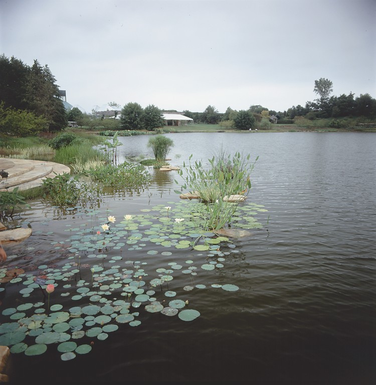
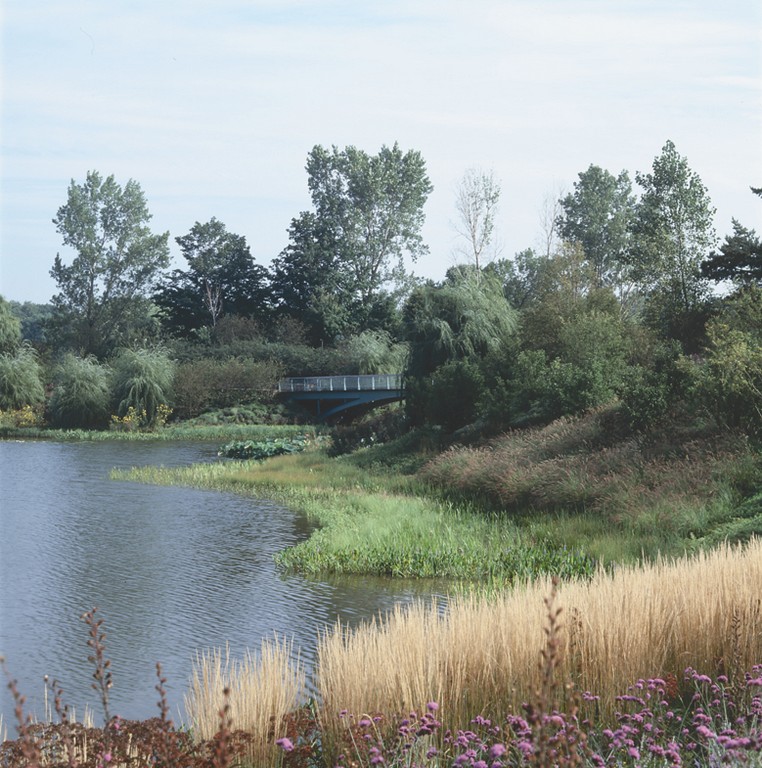
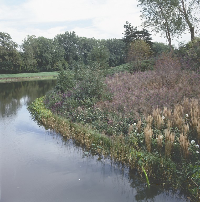
Because the margins are so crucial visually, we used the edges of the island and the opposite shoreline space as a showcase to demonstrate the full range of plants that can be planted next to ponds in this region of Illinois.
This project is so expansive that one of our associates, Lisa Delplace, spent a full three years just researching the plantings for the edge treatments with the goal of creating a seamless, flowing line. (For more information on these edges, see her sidebar, below.)
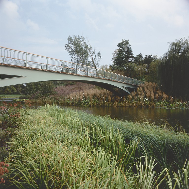
The plants we came up with – lotuses, arrow leafs, water lilies, cannas, water irises, assorted other water plants and a wide range of grasses – show the extraordinary range of species that can be used in this climate zone in association with water.
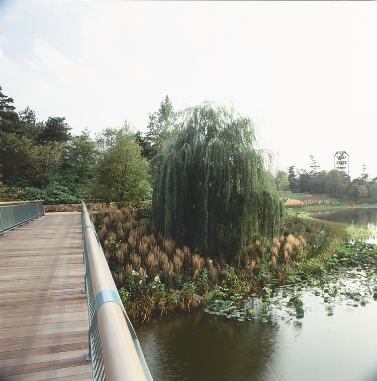
We also planted a great collection of trees, including crab apples, weeping willows (right by the water), alders, maples and many other species as well. The facility employs a horticulturist and an expert on water plants, and we worked hand in hand with them as we developed our detailed planting plan to make certain we were all on the same page.
While keeping one eye on variety, we kept the other on repetition as a critical design principle and teaching device. In fact, we emphasized repetition by planting a series of crab apple trees at regular intervals around the basin in a way reminiscent of the use of cherry trees around the Tidal Basin in Washington, D.C.
Our thought was to place the same plants in various locations around the basin so that if someone didn’t happen to see a particular type of plant in one place, he or she would be likely to spot it someplace else. We also wanted to avoid the sense that there was one section of the space devoted to a one type of plant, always focusing on the garden as a fully integrated whole.
BRIDGING DETAILS
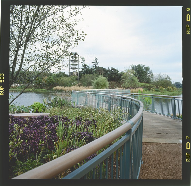
With all these fundamental design concepts settled to a great degree, we built detailed models of features including the bridges, the landings and Evening Island’s main terrace, which is in the shape of a nautilus. We used splendid, organic curves to create paths that would encourage visitors to wander slowly through the space and carefully regard their surroundings – once again, a major goal in a botanic garden where learning is a key function.
In addition to the main sweep of the walkways, we superimposed a fantastic network of paths on the five-acre island that enable visitors to split off the large thoroughfares and move onto smaller paths that are reduced to steppingstones in some spaces. Many of these smaller paths lead to intimate spaces where people can stop and meditate or commune with nature.
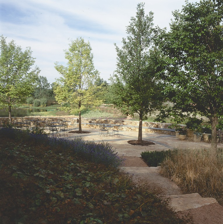
 At every step of the process, we carefully considered the way people would move through all of the spaces under our control and designed our hardscape features accordingly. In this case, the surfaces consist mainly of Illinois limestone accented by Pennsylvania bluestone to create stripes on the terraces. The bridges have wooden decks, and the paths have rich, reddish/brown colorations – everything intended to be warm and welcoming.
We also invited Argentinian architect Salo Levinas to design the restrooms and storage areas. These structures double as garden walls and have been so wonderfully disguised that visitors wouldn’t even know they were there without the necessary signage.
This sort of concealment reinforces the observation that we almost always design in layers so that not everything can be seen at once. I’ve always seen the element of surprise as being very important in almost all forms of garden design, so throughout this garden are a variety of intimate spaces that you don’t see until you come upon them.
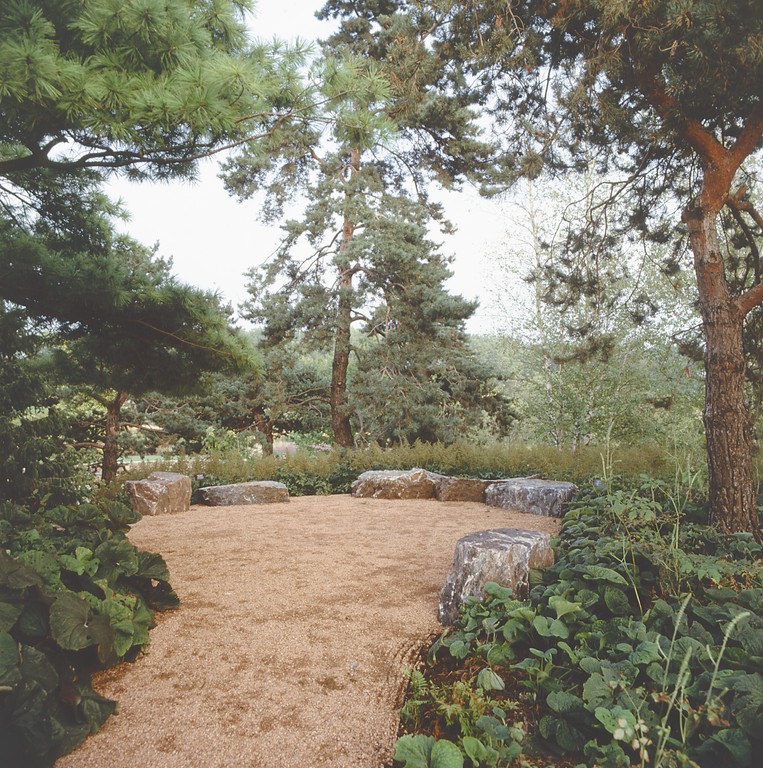
Most significant in this respect, we created two destinations on Evening Island, treating one of the knobs with seating boulders while the other is set up as a sort of council ring – a partial circle of stone where a class or tour group can sit, look and listen. These were both major design elements and have been set up to maximize their views. In both cases, however, you don’t know what’s there until you arrive.
And surprise isn’t always about an unfolding perspective: In the case of the island’s terrace, for example, the thrill of discovery and sense of satisfaction come from getting a full view of the nautilus-inspired paving and perceiving its uniqueness.
THE LEADING EDGE
During construction, the basin was drained to simplify access to the entire work area. (The only thing the crew found, oddly enough, was a formerly submerged car with a set of golf clubs in the trunk.)
Our first major task was stabilizing the edges to accept new plantings – no small challenge, as there’d historically been a great deal of difficulty holding the edges together for any extended period. (Again, see Lisa Delplace’s sidebar, above.)
| ‘The design was quite elaborate and installing it was a matter of great care, astute professionalism and tremendous dedication.’ |
We implemented multiple strategies here, using rockwork in the water and near the edge, setting up a large shelf of mesh extending into the water to hold the plants and placing rock structures in the water to stabilize the bottom while encouraging fish to spawn. There are also large boulders that poke above the waterline, and we set up special sheet-metal planters to contain the lotuses because they’re so invasive.
Suffice to say, the entire design was quite elaborate and installing it was a matter of great care, astute professionalism and tremendous dedication.
When you work for so long on a project of such great scope, it can be tough to step back and consider the overall impression it makes. Since we completed our work in 2002, a great deal has been said and written about the garden, and we’ve been gratified that so many people seem to appreciate and understand what we were trying to accomplish.
Will Hagenah, chairman of Board of the Chicago Horticultural Society, put it this way: “The cumulative experience of this new complex of gardens, terraces and bridges is one of heightened sensory pleasure. It encourages each of us to go slowly, to linger, to allow nature to nourish the human spirit.”
If we can achieve all that with a landscape design, then the designers and everyone involved with the project can feel that they’ve done the job very well indeed.
James van Sweden is a founding principal of Oehme, van Sweden and Associates, a landscape architecture firm based in Washington, D.C. He earned his Bachelor of Architecture degree from the University of Michigan in 1960, then studied landscape architecture at the University at Delft in the Netherlands before serving as Assistant Town Planner for Amsterdam. Upon returning to the United States in 1963, he became partner in charge of urban design and landscape architecture for Marcou, O’Leary and Associates in Washington, practicing there until forming his partnership with Wolfgang Oehme in 1977. Van Sweden’s multidisciplinary design talents encompass architecture, landscape architecture and urban design. He is the author of several eminent books about gardening and maintains an active schedule of related lectures. He is a Fellow of the American Society of Landscape Architects and the recipient of many prestigious awards.


