


Color Keys

|
Even though color is literally everywhere, most people know surprisingly little about it. That’s a knowledge gap designers in particular should overcome, says artist, colorist and teacher Judith Corona, who adds that understanding the nature of color, how it influences moods and emotions and how a color wheel works are all useful when it comes to making valuable recommendations to clients about their watershapes and landscapes. |
Whenever you approach the task of designing a space – exterior, interior or both – your first task among many is to consider the nature of the setting and its surrounding environment. A key part of that initial assessment has to do with considering the colors you can use to reflect and/or respond to the environment.
Will you be blending what you do with colors already present in the environment? Or will your contribution somehow step away from the enveloping color scheme? Either approach is a distinct possibility, and the history of art and architecture is filled with examples of designers working in both directions.
On the one hand are the Prairie-style homes of Frank Lloyd Wright, where wood and stone echo and meld with the earth tones of the Midwestern landscape. On the other are the starkly modern buildings of Le Corbusier, who made homes with stark geometries, glass and cold color palettes that made them stand out against their backdrops.
Both approaches work beautifully (or not at all) depending upon the skill of the designer and how the color palette and materials express themselves – the point being that to succeed with aesthetic choices such as these, you really do have to know what you’re doing and how to put color theory to work.
As watershapers, you ultimately need to know that there is logic and structure to the way colors work together. Regardless of the design mission, making deliberate decisions based on a “technical” understanding of color will enable you not only to achieve your aesthetic goals, but also to communicate more effectively with clients in explaining the thought processes behind key color choices.
COMPLEX RESPONSES
To be sure, color theory is a complex topic – the sort of thing you can study for a lifetime without fully mastering all of its details. Nonetheless, it is part and parcel of the pursuit of artistic creation and creative visual thinking, which makes it essential for designers to come to terms with some of its major concepts and how they can be used to create exterior environments that feature water, landscaping, artwork, stone, tile and other natural and man-made materials.
First and foremost, it’s important to understand that color is all about human perception: As is true of all things related to our complex brains, the variables are endless and what rules there are can be followed, bent or broken as you see fit. But that flexibility isn’t an invitation to chaos: Regardless of the direction a design might take, the only way to play with the rules effectively is to understand their nature and use that knowledge as a guide in working with clients.
| (All photos by David Tisherman, David Tisherman’s Visuals, Manhattan Beach, Calif.) |
You also need to know that color has the ability to influence human emotions and, as such, has long been vested with profound cultural meaning. This means you can work with color to affect moods, evoke specific associations and influence the way people respond when they spend time in the environments you design.
Using this innate power of color is not new, of course. The architects of ancient Greece, Rome and China used color in much the same way those who design shopping malls, resorts and homes do today. It’s long been a pervasive element of just about every place people gather, work and live – a fact that hasn’t escaped the attention of researchers, who’ve conducted extensive studies of the way color influences human physiology.
These scientists have shown conclusively that heart rates, respiration and adrenaline levels rise slightly when a subject is surrounded by reds and other “warm” colors (oranges and yellows). They’ve also discovered that we expand on these responses, learning, for example, to associate red with blood, heat and fire – which is why fire engines are typically painted red to alert us to danger.
Researchers aren’t certain of the extent to which the responses are instinctive as opposed to learned, but it’s probably safe to say that the balance and the level of response, either positive or negative, differs from person to person.
There is no doubt, however, that red has dramatic effects on our thoughts and feelings. The same is true of the so-called “cooler” colors, such as green – but in the opposite way of soothing us and putting our minds and bodies at ease. This may come through evocations of plants and tranquil settings, and the effect is no less profound.
CULTURAL FACTORS
Just look around to see how these observations play out in the world around us. A red light, for example, means “stop, do not proceed, there is danger in not paying attention to this signal.” A green light, by contrast, means “go, it is safe to proceed.”
For their part, white lights are neutral and simply illuminate. But a white wedding dress means something very specific: If a bride in America were to wear a red dress at her wedding, she’d be making a very different kind of statement. And that statement would be altogether different in Asia, where red is associated with good fortune and many women wear red at their weddings.
In other words, our responses to colors are more than physiological, and in contemplating their use in our designs we must also consider and accommodate the cultural associations of the colors we use.
In many African and Asian cultures, for example, white is associated with death, while in Western cultures, black has that association. These cultural cues can even be seen in the names we give colors: Royal blue, for example, traces its origins to the rare blue dyes used in coloring fabrics worn by royalty.
Now consider “fire engine” red, or “forest” green or “hot” pink on the obvious side, then think of more nuanced and subtle colors such as “salmon,” “copper,” “aquamarine” or “indigo”: Each makes a specific reference that helps us identify those colors with ease.
The combination of physiological and cultural color expectations can lead to trouble in odd ways by leading people to make assumptions and choices that aren’t necessarily wise. For example, lots of expectant parents, not knowing the gender of the child on the way, will choose yellow as a noncommittal medium between the traditional choices of pink or blue for newborns’ rooms.
Studies have shown, however, that our response to some yellows can produce anxiety, even among babies with no cultural predispositions – meaning these parents have made a design decision and color selection that will do the opposite of creating a restful space for a small child. In other words, the seemingly neutral cultural option is actually an aggressively poor color choice in physiological terms.
The point here is that, from a design standpoint, it’s important for us to understand that we influence the “audience” in a variety of ways through our color choices and so must choose them wisely.
PHYSICAL NATURE
To understand how color works, you also need to get a grip on its physical nature and the fact that it is always dependent on the light falling on it and the colors around it – not to mention the frequency of its use in the space and the textures, lines and shapes that define its boundaries.
What this means is that, on a practical level, it is virtually impossible to consider color outside the context of the setting: It is never separate from the physical aspects of its surroundings – another understanding we must develop if we are to work successfully with color.
Consider Disneyland, where you see lots of bright, saturated, cartoonish colors used in a deliberate effort to create excitement. The same strategy is used in casinos and recreational settings such as water parks, and these are all examples of using colors to create sensations of novelty of a sort we humans don’t seem capable of resisting.
 By contrast, what we mostly see in landscapes and domestic architecture is very different and welcomes us to more tranquil sets of experiences. This is why we so often see controlled color schemes in planned communities – lots of earth tones and similarly soothing, non-provocative colors.
If you were to plunk an orange or red house into such a setting, it would be novel, yes, but outlandish in its context. Conversely, were you to drop an orange house into a neighborhood in Mexico, where brightly colored buildings are not unusual, it has every opportunity to be perceived as gorgeous rather than garish.
Whether we fully appreciate it or not, we all live in a designed world, and just about everything we see is a reflection of someone’s effort to express an idea. It may take the form of a historical style that comes with a well-known color scheme, or perhaps the client wants to establish a specific experience and mood, or maybe he or she just has a favorite color and wants to see it all the time.
Whatever the specifics of the desire behind color choices, the designer brought in to serve the space needs to take that kernel of a thought and use it in a way that accommodates color theory and the roles of complimentary or analogous colors; tints and shades; density and saturation; and a host of other factors that come into play in the design process.
On that level, color and the way it reflects light at varying frequencies is solidly mathematical in nature: There is structure in color theory, in other words – cues we can use to great effect if we understand them to some degree. By the same token, we need to understand when not to apply the rules. Color theory shows us how colors relate to each other and which colors are used to form subsequent colors and can be quite useful in developing color programs – but we must also keep in mind that there are few absolute dos or don’ts.
DEVELOPING IDEAS
In watershape designs and other settings, we often see colors that make no immediate sense, and it’s painfully obvious that there was no program when it came to selecting and arranging them.
I think of the many pools I’ve seen where piles of natural or artificial rocks are plopped down on a deck for the sake of suggesting a “natural” look – but the colors of those rocks have absolutely nothing to do visually with anything that’s around them. That is, they don’t exactly fit in with the surrounding colors, nor do they stand out among them in a meaningful way.
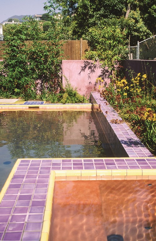
This common design deficit defines some of the basic color-theory issues at play in common backyard environments. For example, one of the things you should always look for is whether or not a color is repeated in the environment. You should also determine whether it is one of the main colors in a particular scheme or is meant to be secondary or an accent.
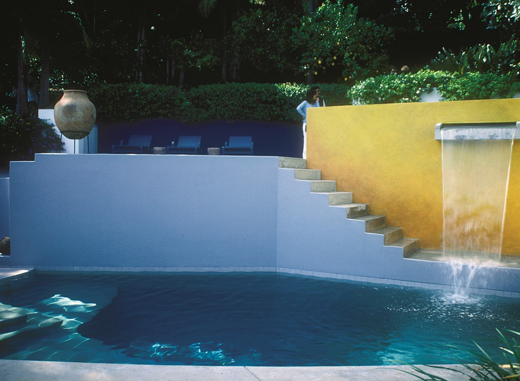
How often a color is repeated relative to other colors will have a major effect on the way we perceive it. We see, for example, a great deal of blue tile used at waterlines. There are some who reject this color usage out of hand, but an argument can easily be made that blue tile works if the color is picked up elsewhere in the environment and has a part to play in an overall design scheme.
If the color appears only at the waterline – and often the blues chosen are too dark or are highly saturated colors – it may well draw more attention to itself than the designer or the client would like. If, by contrast, the blue is part of an integrated plan and is seen at several other places in the yard – as banding around a stone-veneered barbecue island, for example, or as an accent around the home’s doorways – it just might work.
Picking blue tile just because it’s conventional and pool builders and their clients have been making that choice forever does not necessarily mean it’s the right thing to do. The key to applying color theory is to understand the whys and, to a somewhat lesser extent, the why nots. When you have this understanding, you’ll start making choices that have reasons behind them – reasons you can offer your clients in persuasive ways.
COLOR WORKS
In a great many cases, selecting colors is a matter of working with the “rule of three” – that is, with a major color, a minor color and an accent color.
Of course, there can be many more colors in a given scheme, but it is amazing how often a defining trio of colors sits at the heart of a design. You or your client can conjure these combinations as a completely original thought, but very often you’ll “find” the colors in a particular detail – in a tile mosaic, perhaps, or on a particular type of stone being used in the landscape, or within surrounding views.
 As is true in many forms of artistic expression, nature is a fantastic source of direct inspiration – and that is particularly true when it comes to watershape and landscape design.
This is where our innate psychological and physiological associations of colors and experiences often come into play: In a desert setting, for example, it’s likely that the colors of the arid landscape’s stone and plant material will inspire what you do with a design and lead you to make appropriate visual linkages to the surrounding colors. If you go against that grain and choose the colors of a pine forest, the work would stand out against the surroundings.
Either decision might be valid, but it will take a lot more nerve to go with the latter choice, and you’ll almost certainly need to be able to respond to questions about why you’ve chosen a counterintuitive direction to a much greater degree than you would if you decided to go with the natural flow.
On a more technical basis, there are other types of whys that come into play in these situations that have to do with how colors relate to one another. If, for example, you have a situation that dictates the use of greens, a bit of knowledge about the way reds or blues will play into that scheme can be extremely useful. Such knowledge is the essence of color theory, which is why I so strongly recommend embracing its precepts to anyone in the design field.
Again, color theory is a technical subject that can take a very long time to learn, and even people who are good at it may never truly know everything there is to know about it. That said, there are some big ideas that can be very helpful in getting started.
SPINNING WHEELS
We’ve all seen color wheels, and they’re out there in several formats from simple to complex. All of them, however, are based on the same basic idea: Essentially, a color wheel is a spectrum or rainbow organized in a circle.
The most common color wheels have 12 colors: the three primaries (red, blue and yellow, which theoretically can be used to make every other color); the three secondaries (purple, orange and green); and the six tertiary colors (yellow-orange, red-orange, red-purple, blue-purple, blue-green and yellow-green).
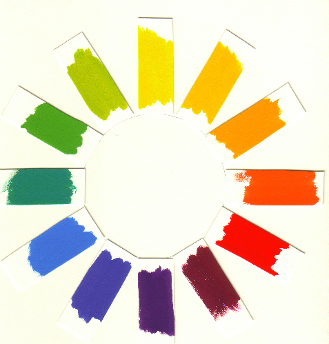
| A basic color wheel. |
The arrangement of these colors on the wheel is all-important and entirely meaningful. Colors that are opposite each other, for example, are known as complementary, meaning they do not contain any of the counterpart color. Red and green are complementary, and so are blue and orange or yellow and purple. The primary colors are always directly opposite a secondary complement.
 What we need to know most about complementary colors is that when you place them next to each other, they potentiate each other, meaning the boundary between the colors becomes energized and draws our attention.
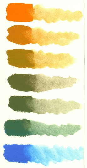
| Blends starting with the complementary colors blue and orange. |
We also need to know that when we mix complementary colors, we are essentially pulling them towards gray. This is something few people who haven’t studied color theory recognize: Grays are not always mixtures of white and black, but instead are often mixes of complementary colors that work so subtly together that they often appear to be something other than purely gray.
What’s interesting is how these relationships play out in a design. If you have a large red area next to a large green area, for example, the red will appear redder and the green will look greener than would be the case if they weren’t adjacent to one another. If, however, you have a tile mosaic in which all sorts of little red and green pieces end up being next to each other, they will start to flow together to form a gray. In this sense, the proportion of one color to another and how they are distributed becomes very important.
Back to the wheel: Where colors opposite one another are complementary, those that are next to each other are said to be analogous. These are colors that are very similar to each other and actually contain each other – red and orange, blue and purple, yellow and green.
Depending on the system of color theory you’re using, these analogous colors can be used to develop a greater sense of unity within a scene with far less drama or contrast. Van Gogh, for example, used literally hundreds of variations on yellow in some of his works.
COLOR HARMONIES
Now we need to put down the color wheel and consider three other dimensions that color occupies: hue, value and chroma.
[ ] Hue is simply the name of a color, and while it’s often interchangeable with the term color itself, hue is the more accurate term. [ ] Value refers to the lightness or darkness of a given color as measured on what is known as a value scale. In most value scales, the lighter colors are located at the top, the darker colors at the bottom.Within the dimension of value we find two other important terms: tint and shade. Many people don’t know the meaning of these terms, but it’s really very simple. Tints are colors that are mixed with white, often referred to as pastels. Shades are colors mixed with black and are, naturally, darker and found at the lower end of the value scale.
This particular distinction may be important in designing such things as plaster colors, where you have a choice between using white cement to create tints or gray plaster to create shades. It also comes into play with issues such as grout selection for tile installations. Lighter grout makes adjacent colors appear to be darker in value, while dark grout makes adjacent colors appear lighter.
[ ] Chroma is the strength, intensity or saturation level of a given color. Colors that are strong are high in chroma and pure – “fire engine red,” for example – while weak colors are low in chroma, are duller and tend toward the grayish.All colors can be described using these three terms, and many designers have and use what are known as “hue charts.” These depict hue variations with varying values, with lighter colors located near the top and darker colors near the bottom. Colors with lower chroma are on the left, while brighter, more saturated colors appear on the right.
These guides are available for all colors and can be wonderful for both understanding how these dimensions of color relate to one another and – much more important – for choosing the right colors within a given color scheme.
IN THE YARD
Ultimately, helping you select the right colors and color combinations in the practical world of watershaping and exterior design is the real value of color theory. At the same time, it’s important to recognize that our perception of color is relative to a variety of conditions and therefore that absolutes do not exist.
Consider the color green as an example: In a landscape, there are an infinite number of greens to work with, and they have a variety of values and chroma as well as subtle variations in the form of color mixes. We know that many of these greens have lots of yellow in them, some lots of blue; we see that others are nearly gray while others are almost black.
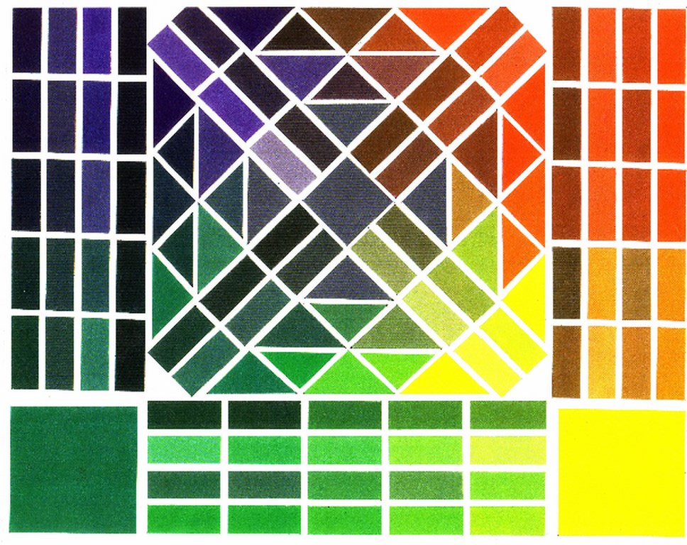
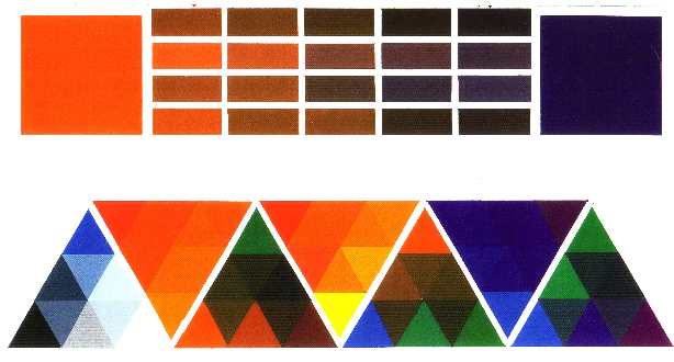
| Those who work with color have a wide array of tools at their disposal that define the relationships between and among colors. If you’re unfamiliar with such guides (including these two color maps), they can look impenetrable. But once you get the hang of them, they become incredibly useful in helping you select colors that work together. |
We also see the difference sunlight makes. Some plants in direct sunlight seem quite translucent while others are profoundly opaque – a distinction that affects the way we perceive their colors. We also observe that the time of day or angle of the sun influences the ways colors look and that the same color may look very different from one time period to the next. Cloud cover (or the lack thereof) has a strong influence, too, as do the colors placed around a given green.
Charting and specifying all of these details of color in an environment as large as a backyard is a practical impossibility, but understanding the effects of these factors will serve you well as your design unfolds.
The same holds true with the colors of stone, various hardscape materials, tile, interior finishes, coping and more. Your choices here can range from the subtle to the bold. By using hue charts and a color wheel in combining all their colors and deciding how to arrange them, you will work more effectively as you coax the selected colors toward co-existence in the given space.
On that level, your knowledge of color theory is a powerful design tool, and being conversant in its principles can only help you in leading your clients to the right choices for their projects.
Of course, there’s no convenient place to end a discussion such as this, because all we’ve done is crack the door open to a different and exciting way of looking at the world and the projects in which you might bring this sort of knowledge to bear. If there’s just a single idea to take away from this article, it’s that color must be considered from a variety of perspectives in any design.
If you already have a deliberate idea of why you use specific color sets in specific designs, you’re a step head. If you back that intuition up with a basic understanding of color theory, you’ve jumped to the head of the class – and your clients will see the difference every time the walk out into their backyards.
Judith Corona is an adjunct associate professor of art at Otis College of Art & Design and is on the faculty of the UCLA Extension Program’s Architecture, Interior Design & Landscape Architecture Department, where she has won several Teacher of the Year awards. She also has her own studio in Malibu, Calif., and her painting have been exhibited in the United States and Europe. Corona conducts color-theory seminars for Genesis 3 as well as art and architecture tours for UCLA and has also been a guest artist/lecturer for Crystal Cruises. She has a master’s degree in fine arts from California State University, Long Beach and a bachelor’s in fine arts from the University of California, Irvine. In addition, she has received a studio artist fellowship at Whitney Museum of American Art in New York.