


Blue on Green

Over and over again, I’ve said and written that the water should not be seen as the most important element in a well-designed space.
In fact, I’ve said it so often that it’s almost become a cliché, and that’s a shame, because it tends to trivialize the valid point that all elements in a given space – plants, rocks, hardscape, lighting, artwork and water – need to co-exist in visual balance to create an overall experience.
This concept of visual balance should indeed be the heart and soul of all our exterior designs, but it’s apparent the message hasn’t sunk in far enough. Many people give it lip service, but too often I find these same people setting up pools, spas, fountains and various other watershapes that are garish, out of scale, improperly proportioned and overstated in ways that show a lack of understanding of the fundamentals of what they’re professing to do.
Not every project calls for a big fire effect, red plaster, a vanishing edge, a slot overflow or laminar jets. These elements can be used to great effect in the right context, of course, but using them without understanding their role in achieving visual balance too often results in jarring disharmonies instead of well-tuned spaces.
Let me illustrate exactly what I mean with a New Jersey project my partner and I have been working on for a while now – a job that entailed complete integration of watershape and landscape design in a measured package that relies on balance, scale, color, texture, water, stone, plants and sculpture to create a surprising yet subtly composed setting.
COUNTERPOINT
The story begins with my partner, Kevin Fleming, who has a bachelor of science degree in landscape architecture. The fact that his background complements mine and that we’re able to teach each other is what makes our collaboration work: I’ve raised his awareness when it comes to quality watershape design and construction, while he’s brought the magic of landscapes into much sharper focus for me.
This marriage of the blue and the green is nothing new, of course, but each and every time we work together and fully integrate plants, rocks, hardscape and water, the results are extraordinarily gratifying – and I come to appreciate more and more just how important Kevin’s understanding of plants and landscaping principles is to what we accomplish for our clients.
|
No Stone Unturned All too often, I’ve seen jobs where stones have been ordered from a quarry or stone supplier by type and quantity and have simply been dumped at the site, leaving the watershaper or landscaper to work with what has shown up. Instead, I’d suggest that it’s important not to rely too heavily on those hard-working folks to make decisions for you when it comes to stone selection. Had we taken that approach with the project described in the accompanying text, the results would not have been nearly as satisfying. This design in particular involved the use of natural stone in a contemporary setting. This meant that everything had to have a certain geometric/sculptural quality to it, which in turn meant that my partner and I had to visit local suppliers to set parameters and make it possible for Kevin to continue this work on his own while I was back in California. The stones he selected have a tremendous amount of variety, with all sorts of flat planes and irregular, nearly convoluted areas. There is no way on earth those specimens would have arrived on site had the decision been left up to someone pulling material from huge piles with a forklift. — D.T. |
Early this year, we were called in by a couple living in Cherry Hill, N.J. – extremely sophisticated, fully involved in the world of art and design and owners of a home that completely reflected their sensibilities and passions. Indoors, at least.
The outside was another story. The sloped property rose from the street to the front of the house via a long driveway that cut a course through a drab landscape focused on a grim, circular pad. It was an aesthetic disaster, with trees in the wrong places, dying plants, inadequate drainage and an overall case of the uglies. Visitors walked across a broad space to the front door on a course that offered not a single item of visual interest.
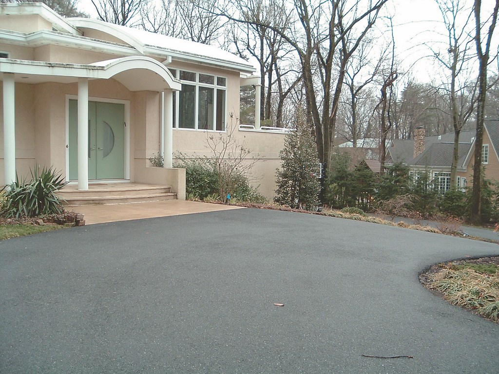
Once inside, however, the home came to life with beautiful furniture, travertine floors and all sorts of gorgeous paintings and sculptures.
Kevin had been in occasional contact with these clients for upwards of three years, in which span they’d met with more than a half-dozen companies none of which had a clue what to do with the space. It wasn’t a question of budget: The project had never moved forward because nothing the clients had seen appealed to their artistic sensibilities.
When Kevin and I visited the site together, we met briefly with the clients and then I left to get the lay of the land on my own – an objective assessment I use in thinking about a space and its potential. After a time, we all met up again and I suggested that what was needed was an entry that offered something special, either a gradual process of discovery or even a surprise, as well as features that encompassed their love of reflections and the sounds of moving water as well as their passion for art and great materials.
A SUBTLE REVEAL
After a great deal of discussion, I suggested tearing out a good portion of the existing driveway and using walls and plantings to create a visual barrier between the street and the home’s entry that would conjure a sense of interest among those passing by as well as a sense of anticipation in guests who drove up to approach the entry. The idea was that in pulling up to the house, one would move through a beautiful setting that hid something special just beyond.
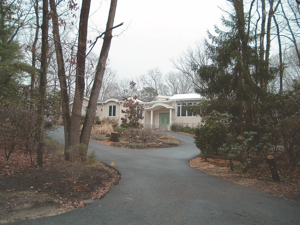
| The original approach from the street to the house was downright drab in an area filled with similarly uninspired, utilitarian driveways. Our work in up grading the site involved removing a good bit of what was there and replacing it with a dynamic composition in water, masonry and greenery. |
This was the scene we went on to set for them: The foreground is lush and inviting on the drive to the garage, but in the background one sees “stars” in the form of moving, shimmering water flowing down a rough-textured wall. As the observer approaches, the water becomes visible through the greenery and the subtle sounds of moving water join to create an impression. Then, in walking up a set of stairs and moving toward the front door, the scene changes: The water wall disappears and guests come to an area dominated by a large reflecting pond and are soon enveloped in the space as they walk across the surface of the water to reach the door via a set of shallow stepping pads.
Completing the picture for the clients, we also suggested that they should include a piece of sculpture off to the side of the space, set on a pedestal rising from the water. That last element sealed it: They loved the idea and decided to move forward.
With the basic program in mind, it became a matter of setting the style. My first drawings were organic and free-flowing, based on conversations we’d had to that point. But then the discussions started turning toward something more contemporary, mostly because they’d just purchased a special blend of glass tile from me for a kitchen splash, loved the look and wanted to incorporate it one way or another.
This led to a series of conversations that resulted in drawings that were angular and rectilinear, with the stepping pads and sculpture as well as inlaid spillways and numerous glass-tile details – all of it tied into and (literally) reflecting the home’s architecture.
But before long, our thinking headed back in the organic, naturalistic direction and led to a new set of drawings that included carefully selected natural boulders, a dogleg to the right that leads to the sculpture and a very subtle water wall/edge effect at the front of the entire affair. After a few more rounds of discussion, the organic approach won the day.
POLISHING THE IDEA
Now that we were starting to get specific, our discussions became less about big concepts than they were about details and refinements.
In reviewing my portfolio, the clients had expressed a strong liking for a blond-colored stone I frequently use. Unfortunately, that type of stone is not available from local suppliers who tend to focus on local favorites such as gray fieldstone, bluestone or Tennessee crab orchard stone along with other materials from the same basic species and family of hues.
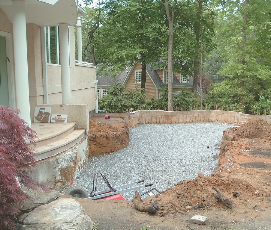
| The home’s entryway was completely revamped and will now include walkways along and across a pond as well as a water wall that features stone placed or stacked in ways that will maximize the visual liveliness and sound potential of the flow down its face. |
To get what they wanted, I turned to my friend Joe Nolan of Malibu Stone & Masonry (Malibu, Calif.) and started talking about materials that would work in the freeze/thaw cycles of the northeast while still meeting the aesthetic requirements we were developing. Nolan sent a variety of samples to the clients, mostly Sweetwater, a beautiful material I’ve used on other projects in New Jersey, Pennsylvania and Delaware. It has a wonderful mixture of creams, browns and greens.
The watershape design was to be rounded out with my custom purple-colored pebble finish, perfect for reflectivity even in a shallow pond with its deep, rich, warm color. We also discussed the boulders, settling on a large, local fieldstone with great texture and sharp, angular clefts and fractures.
The final watershape-design scheme plays off a creative water-wall treatment: In moving up the Y-shaped driveway, those who pass to the right and head for the garage pass a set of stone steps and are confronted by a six-foot retaining wall. The face of the wall is covered by a flow of water over the irregular edges of stone that cast the water out several inches in places, generating a lot of sound and also creating “stars” of water that catch the light and observers’ eyes. All in all, it promised to be an inviting, people-pleasing visual and aural effect.
Heading to the left at the fork in the driveway, guests pass a planted slope (on the right) and see to the left another planted slope on their way to a parking pad separated from the front door by the pond.
All of these elements work together as an organic design highlighted by the materials, the color palette and, ultimately, the plantings. At last, we had incorporated everything the clients wanted and it was time to move forward with an understated design scheme that would lend a wonderful sense of unfolding discovery to a space that was still quite hideous at that time.
TURNING GREEN
One of the keys to the design is the large, planted slope on the left fork of the driveway – an area that now serves as a distant focal point for those standing at the entry. In this case, we used the same stone materials we’d placed around the pond to create irregular terraces and small retaining walls to interact with the rich plant material. (Ultimately, this space came to include a small sculpture.)
|
Ground Work In the accompanying column, David Tisherman describes a project in which the use of natural materials, stone and plantings were essential to making the entire design work visually. The overall design idea was based on creation of spatial surprises and confrontations with the unexpected. From the street, observers are immediately caught off guard by the look of the entryway, the gorgeous plantings and the glimpses of water dancing off the rough-hewn wall – all highly unusual and new for this area. As invited guests move up the driveway to the parking pad and get out of their cars, they’re greeted by the unfolding view of the reflecting pond, planting areas and stone materials. The next surprise is the stepping pads that lead across the water – then, as visitors finally reach the front door, they see through plantings on the right a sculpture that jumps into view. In this case, the integration of these diverse elements begins with the stone materials chosen for the project. We were constructing sets of retaining walls that included ledger details and incorporated a variety of carefully selected Pennsylvania fieldstone boulders, so those structures really served as the visual underpinnings of the landscape design. The use of boulders as entryway steps from the garage side of the driveway was another integrative design element: They’re of the same variety as those we used in the watershape and the surrounding landscape, and in fact we ended up using the same species in building the walls. The environment of surprise as well as the visual unity of the overall setting was fully supported by the plant selections. The scale, placement and texture of these plants were all important, starting with key areas where we used green-leafed Japanese maples and dwarf black pines to create strong focal points within the main entryway composition. At the point where the driveway splits, we established a landscaped island and planted it with wonderful broadleaf evergreen trees known as Nellie Stevens Holly to cut off the view up the driveway toward the home. We also established soft, textured areas with a variety of ornamental grasses and flowering Liriope (not technically a grass, but a close visual match just the same), setting up massed areas that interact with the edges of some of the stone material and generally give a soft, undulating, organic look to the planted areas. At the back of the design adjacent to the house, we used a large mass of red-twigged dogwood shrubs. This choice works particularly well in the northeast: In the winter when the leaves fall off, you’re left with the beautifully interesting red stems. — Kevin Fleming |
As the installation progressed, it became obvious that this view would be a real attention-grabber. On several occasions, we caught trespassers and otherwise curious folks who would come on site for a look. When confronted, they beat hasty retreats and often managed to wreck sprinkler heads on the way out. Other times, the driveway or street were blocked by people who just had to take a look.
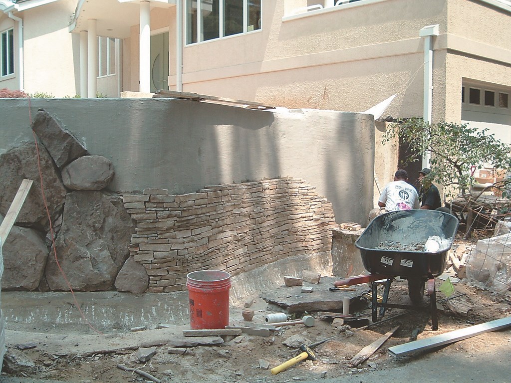
As the boulders and flat stonework and plants went in (a process discussed by Kevin Fleming in the sidebar above), the site-changing effects we were after began to take shape.
This is a case where my collaboration with Kevin was critical to our success: Without his project-management skills and talent as a landscape designer, none of this would have been possible. What makes it all work is the blending of elements, the appropriateness of scale and the elements of surprise that are achieved through subtle use of rock and plant material.
Given that were working with a relatively large space – about 900 square feet for the watershape alone – we certainly could have pushed to include all sorts of larger, more elaborate effects, but we didn’t. Instead of flash and showiness, we invoked more enduring principles of design to achieve an overall impression and experience for anyone who walks up to the home’s front door.
Coming in January 2005: A pictorial review of this front-yard project.
David Tisherman is the principal in two design/construction firms: David Tisherman’s Visuals of Manhattan Beach, Calif., and Liquid Design of Cherry Hill, N.J. He can be reached at tisherman@verizon.net. He is also an instructor for Artistic Resources & Training (ART); for information on ART’s classes, visit www.theartofwater.com.