


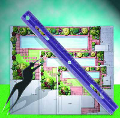
Size Reconsidered

Most of us are in business to earn a living, which is probably why so many of us think of the high-end market as the place to be.
In general, of course, the bigger the job, the larger the paycheck will be. But when I look more closely at the work I’ve done through my career, I believe we might be overlooking valuable opportunities for personal and professional growth by being so single-minded in pursuing grand, big-ticket jobs.
When I started my business 15 years ago, I was happy to find work on small borders in small spaces. Since then, I’m proud of the fact that I have worked my way up to designing for multiple-acre estates. To be sure, I much prefer having a few large jobs to a bunch of smaller ones, but lately I’ve found renewed value in thinking small.
On a pure design level, I’d say that small jobs can be even more challenging than big ones. I’d also say that I generally learn a good bit more from configuring small spaces and thinking through every intricate detail than I ever do from designing large sweeps of land. These limited canvases force me to pay more attention to how things fit together and to the ways in which scale, texture, color and balance influence my design decisions.
MEASURED REQUIREMENTS
This is not to say I slack off with big projects – far from it. But with larger landscapes, elements can be spread out more easily, challenges are easier to address and physical imperfections (such as equipment pads for watershapes) are easier to hide. In addition, more design elements can be put into larger landscapes because they won’t tend to compete visually with one another when observers step onto the property.
In a smaller space, by contrast, every element needs to be carefully planned and placed to avoid visual conflict with any other focal point. The number of specimen plants, for example, will be smaller, and each one will be selected with special care because each carries so much more visual weight in the confined space.
At that level, it’s much harder to stay on the same page with clients whose driving interest is making certain their little paradise includes each and every one of their favorite plants and design details.
This brings up what I consider to be the primary responsibility for the designer of a small space – that is, to educate clients about the need for balance, harmony and restraint in achieving a visually appealing landscape. In general, I tell them to think of a small room so cluttered that it feels cramped and disorganized and do all I can to get them to understand that these are sensations they want to avoid in their gardens.
That risk of cluttering exists any time we try to do too much in a small space. To avoid such problems, I begin by evaluating views from inside the house, which is where the clients will be most of the time. I use these primary vantage points to guide my approach in just about every design I prepare, big yard or small, but it’s particularly important to take this visual inventory with small yards to make the most of up-close, intimate views that will ultimately be the most critical.
Once I’ve sized up the space and determined the clients’ primary wants and needs, I usually create a conceptual design that takes off from the main vantage point inside the house. I do so because I want visitors who reach that “sweet spot” to be drawn out into the garden – and I know that something has to grab them visually for this to happen.
Outside, I configure the space to suit client requirements, trying to balance the visual and functional appeal on a full 360-degree turn. I do so because I like developing a sense in the observer that he or she is fully surrounded by the environment – something that is more literally true in a small space than it is with a big one. (I am also aware, of course, that I want to avoid generating oppressive sensations of claustrophobia!)
To demonstrate what I mean in more specific terms, let’s take a look at a couple of small-space projects I’ve completed through the years and the strategies I’ve developed for turning compact settings into spacious outdoor rooms.
[ ] Indoor Atrium
Several years back, I was asked to take a look at an odd “outdoor” space trapped within a house between the kitchen and the family room. Essentially an eyesore to start with, the atrium was then a patch of dirt hemmed in by glass on three sides with a white stucco wall on the fourth with a picture window in its middle. One of the glass walls was a sliding glass door that provided access to the space.
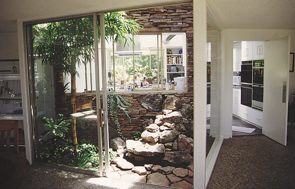
| Converting this small space from eyesore to centerpiece required me to fine-tune the details and consider how the results would be seen from every conceivable angle. |
After contemplating the area from many vantage points and discussing various design options, we settled on blending the space into the overall, ’60s-rustic aesthetics of the house – lots of stonework and generally clean, straight lines.
We decided to cover the picture-window wall with ledgered stone from which a rock formation now protrudes with a gentle cascade of water. This provides sounds that echo through the space and overflow into the adjacent family room, drawing attention to the space while eliminating the unsightly white wall.
We also planted a specimen bamboo called Bambusa vulgaris ‘Vitata’ as a botanical focal point, blanketing its base with shade-loving plants including ferns, Aspidistra (Cast-Iron Plant) and mosses.
This design took a 50-square-foot disaster and turned it into a showplace in the center of the home. It also showcased my design abilities, by the way, and helped me get a contract to design the home’s two-acre backyard.
[ ] Suburban Square
A more recent project took me to an up-and-coming middle-class neighborhood in Los Angeles. I would classify the home as “eclectic contemporary” – relatively small with a separate garage situated on a back corner of the property.
Moving beyond the existing stretch of dead sod and old “lollipopped” plants, my goal was to make the garden more appealing while masking the garage and compensating for the fact that the property backs up to an elementary school. My first view of the garden was from the home’s front door: It offered me a prospect all the way to the back of the property, where a tall wood fence with horizontal slats had been painted in two tones to match the house.
After much discussion, we decided to place a simple waterfeature along the axis from the front door to the back of the lot in front of the existing fence, backing it up with a clump of specimen bamboo. In the foreground is new concrete patio wrapped by a raised, artificial-wood deck. Stepping down from the deck, the homeowners and their guests move onto a central patch of grass. Surrounding the grass is a pathway that guides visitors around a small but precisely planned space that offers a number of eye-pleasing prospects.
The north wall is covered with mirrors to make the space seem larger. The east side’s horizontal slatted fence backs up the fountain, while the south wall has a mural now reflected in the mirrors. Minimal planting completes the picture, leaving a feeling of spaciousness without any sense of clutter.
[ ] Spanish Influence
Another recent project includes a broader range of design elements, the main one being a lap pool attended by three water spouts, planting borders and two decks.
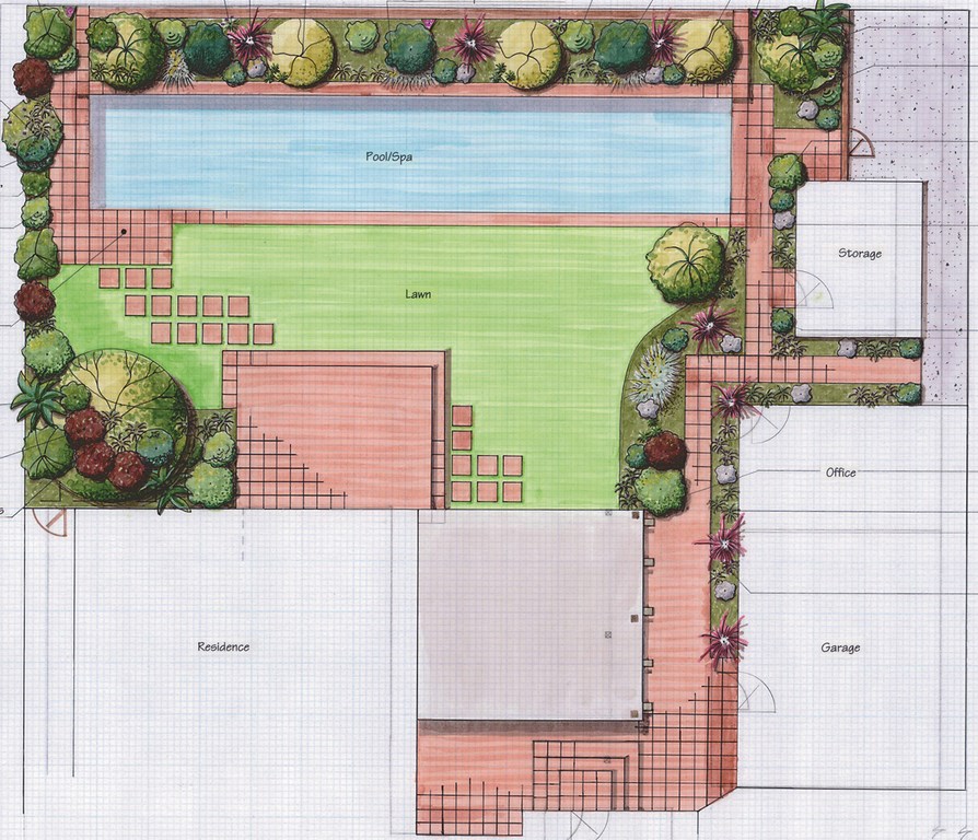
| In this compact yard, the presence of the lap pool creates a sense of greater width, while terra cotta’s colors and textures tie the exterior space back to the Spanish-style home. |
Working with the Spanish-style architecture was the key to configuring the space. All of the hardscape is appropriately covered with a terra cotta-colored concrete tile, an exception being the raised bond beam, which, along with the water spouts, is bedecked in six-inch ceramic tile in mixed shades of terra cotta, green and yellow. The spouts emerge from three sun-shaped wall hangings (each one different), with the water spitting out of their mouths.
The lap pool stretches the space visually, an impression reinforced by the surrounding plantings that serve as its backdrop. Simplicity is the key: The plantings are balanced with a mix of soft, medium and coarse textures, and the foliage is about 75% shades of green mixed with about 25% in burgundy.
By limiting the hardscape to two materials and keeping the plantings basic, we maintain visual focus on the pool while creating an inviting setting for relaxation.
IN A NUTSHELL
With all of these projects, careful planning was required to ensure visual balance while avoiding visual overload. The goal is to enable the viewer to feel as comfortable in a small space as he or she would be in roaming around a larger, rambling garden.
I look at the challenge as being similar to downsizing in houses and taking all the furniture in a 20-by-20-foot room and making it work in a 10-by-10-foot room. There must be space to move around comfortably, and focal points must be arrayed visually so there’s never a sense of claustrophobia. Again, it’s all about balance and harmony and drawing the viewer into the room.
If one element or another disrupts things, it’s time to find another place for it to be. That’s the key with small spaces: You need to throw some things out, organize everything better and hold on to the things most cherished.
It’s this mental exercise of having to consider every detail that, I think, makes smaller jobs so valuable to a designer. I see the challenge of configuring everything and making it work together as a bit of a check on my design abilities. As always, when the client is pleased with the outcome, I know I’ve done my job well.
Stephanie Rose wrote her Natural Companions column for WaterShapes for eight years and also served as editor of LandShapes magazine. She may be reached at [email protected].