


By Contrast


Practice makes perfect when it comes to developing the observational skills you need to support your design acumen.
As I discussed last month, honing these abilities enables a designer to see individual and collective shapes within a garden setting in ways that can enhance the overall appearance of plant/hardscape combinations and turn them into cohesive and more compelling visual compositions.
Among all of those artistic abilities is one specific skill that has served me best and will be my subject in this column: That is, the ability to determine the level of contrast my clients want to see in their garden spaces.
As an artist, I’ve always been inspired by the areas in paintings that display the greatest contrast. To my eye, these areas offer the greatest sense of depth and provoke the most interest in the composition, transforming two-dimensional canvases into three-dimensional works of art. That’s just the sort of magic I want to bring to my designs.
FINDING INSPIRATION
I am particularly intrigued by the art of botanical illustration and recommend it as a subject for close study if you’re interested in developing an eye for contrast, depth and dimension.
To draw or paint any botanical specimen properly, the artist first needs to pore over the various parts of the specimen, noting the shapes, colors, relative sizes, appearances during growth and at maturity and many other qualities that go into creating an accurate rendering.
Revisiting last month’s column for a moment, if you observe a quality painting of a plant, you’ll notice that the work appears to take on depth (instead of appearing flat) in places where a color goes from its darkest dark to its lightest light. The darker areas recede from you, while the lighter areas come forward.
It’s the same thing as looking at a line drawing, which will always appear flat even though some lines are drawn to denote dimension. That same drawing takes on depth, life and interest only when shading is added.
To that end, as a designer I approach every landscape as if it were a blank canvas – which in essence it is. I know I need to manipulate color and shadow within that visual plane in a way that gives it depth and dimension that will interest observers and signify the success of my design. Using plants and hardscape as my medium instead of brush and paint, I transform an empty garden and bring it to life in the same way a painter enlivens a piece of canvas.
To illustrate these points, let’s imagine a sequence of simple drawings – in this case of a simple circle on a piece of paper. Add shading to that same circle and you have a sphere that, while it appears three-dimensional, has no anchor in space. Let’s take it a step farther and add shading to the surfaces surrounding the sphere: Now you have an object that has dimension as well as a position relative to other objects in space and will either be resting on the surface or floating above it, depending upon where you’ve put the shadow.
When viewing this completed drawing, the area that stands out the most is where the darkest darks are against the lightest lights – in other words, the area of greatest contrast. To me, the stronger this contrast, the more interesting it is, although that’s largely a matter of personal taste and your own aesthetic sensibilities.
COLOR BASICS
So let’s look at different degrees of contrast and determine what they actually mean. Before we get there, however, let me clarify: When I talk about contrast, I’m referring to the differences we perceive between objects based on colors, the intensity of those colors and the relative values of those colors.

| Figure 1: Graduated greens, from strong to neutral. |
* By intensity, I mean how strong the color is, ranging from a pure color to one that is muted to a grayish tone. As an example, Figure 1 shows a graduated range of “green” going from a strong, pure green to a neutral green that has been mixed with its complementary color – that is, red. (Without getting too deep into color mixing, suffice it to say that when you mix colors opposite one another on the color wheel, you neutralize them and create a grayed version of the pure color.)

| Figure 2: Graduated greens, from pure to pale. |
* By relative value, I mean how strong the color is. To illustrate, Figure 2 shows a gradation of the same green, going from a strong, pure green on the left to a very pale green on the right. (Colors can also vary in shade from, say, a blue-green to a yellow-green with everything in between, but let’s not get too complicated here.)

| Figure 3: Degrees of contrast. |
As you look at these two figures, imagine that they are plants: If you put the palest green next to the darkest green, you’ll see the greatest contrast (Figure 3A, at left above). Conversely, by placing two similar greens next to each other, you invoke less contrast (Figure 3B, at left below).
 What becomes evident when you compare 3A and 3B side by side is that greater contrast translates to greater depth of the visual plane.
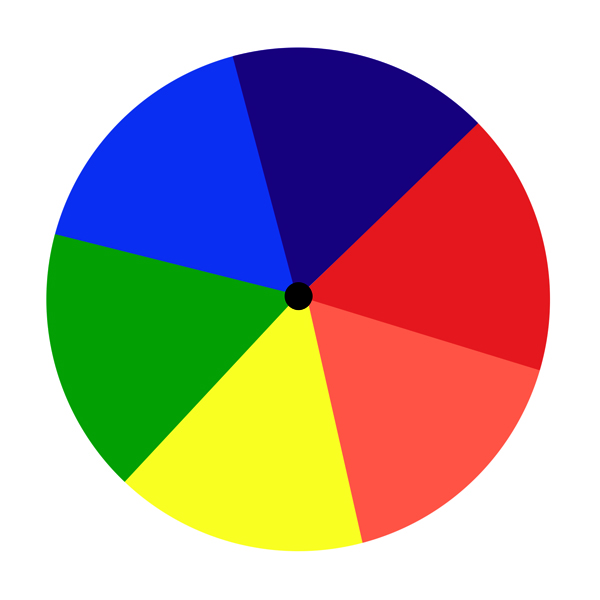 A common color wheel (Figure 4) offers another easy way to determine what colors will create greater and lesser contrasts, even if the wheel is limited to a display of only the primary (red, blue and yellow) and secondary colors (orange, green and purple).
| Figure 4: Basic color wheel. |
The colors that are opposite each other on the wheel are known as complementary colors. Thus, red is the complement of green, blue is the complement of orange and yellow is the complement of purple. Colors that are next to each other on the wheel are referred to as analogous colors, with, for example, red being analogous to orange and blue to green.

| Figure 5: Analogous (A) and complementary (B) colors. |
Using analogous colors next to each other in a design creates subtle contrast, while placing complementary colors next to each other intensifies the degree of contrast – a concept illustrated in Figure 5 (at left), where red and orange are analogous and yellow and purple are complementary.
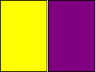 If you stand across the room from these diagrams, you’ll see how the analogous colors in 5A (top) tend to blend together (because there’s less contrast between them), while the complementary colors have greater contrast and offer a greater sense of depth. In 5B (bottom), the yellow advances toward the viewer, while the purple moves away from the viewer.
REAL-WORLD APPLICATIONS
If you’ve ever wondered why most designers don’t do “yellow” gardens, it’s because the yellow is so intense that it moves toward you visually to a point where it dominates designs. (“White” gardens can do the same, but I’ve never been a huge fan of monochromatic palettes anyway.)
Translating all of this to gardens, a plant design that incorporates more intense contrasts is one that appears to have greater depth and dimension. Where a plant program consisting of mostly light greens might seem quite flat, by spotting in a few darker-green plants you instantly add depth to the design and create a more interesting view.
Within any garden setting, the more you vary the colors, the intensity of those colors and the range of their values, the greater the overall contrast and the greater the sense of depth and dimension. Not everyone likes a lot of contrast – something that must be settled with your individual clients – but there’s plenty of room for maneuvering on the spectrum of contrasts available to you if you begin to think (and design) in these terms.
Some clients may like subtlety, while others may crave intense variations. Bright, bold colors in complementary tones (such as orange and purple) are tailor-made for the client who wants the interest, depth and dimension those strong variations create. On the other hand, pastels and muted tones in a narrow range typically catch the eye of a client who prefers a softer, less contrasting palette.
To be sure, there are just as many shades of clients as there are tones of any one color. It’s your job as a designer to determine what degree of contrast appeals to your client and, armed with their preferences and your skills at constructing a planting plan, come up with a beautiful design that meets all their expectations.
Stephanie Rose wrote her Natural Companions column for WaterShapes for eight years and also served as editor of LandShapes magazine. She may be reached at [email protected].