


Working with Color

We live in a multi-dimensional world.
Most people understand that space has three dimensions: height, width and depth. But relatively few people look at color in the same way – that is, as a three dimensional phenomenon. Understanding these three dimensions of color can become the key to unlocking your creativity as a designer.
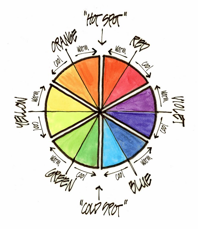
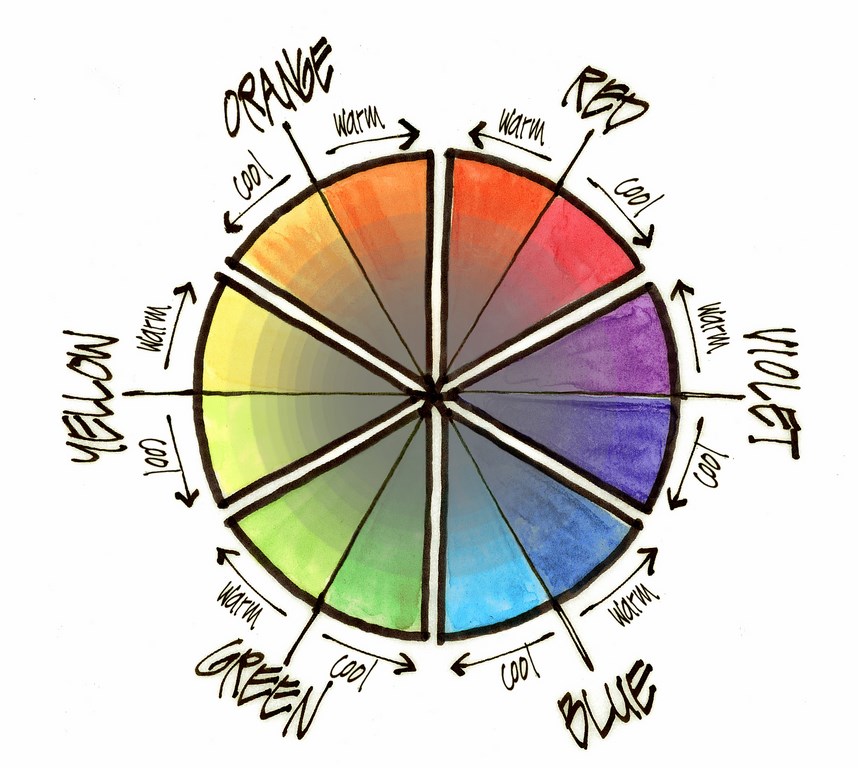
We began our study of color in LandShapes’ May/June issue (“Designing in Color,” click here), where we explored the scientific nature of color and its first dimension – hue, the name of a color (red, yellow, blue, orange, green or violet) – and learned that each hue has a temperature range (from warm to cool). We also learned that all six hues may be organized and better understood through the use of a helpful tool developed by color scientists called the color wheel.
We will now continue our study of color by exploring the second and third dimensions of color and then by discussing contrast, analogous and complementary colors and color harmony. This will enable us to begin applying these fundamentals as landshapers and see in practical terms how understanding these fundamentals can help us become better designers with color.
Let’s continue our journey into color by learning about its second and third dimensions: value and intensity.
NEW DIMENSIONS
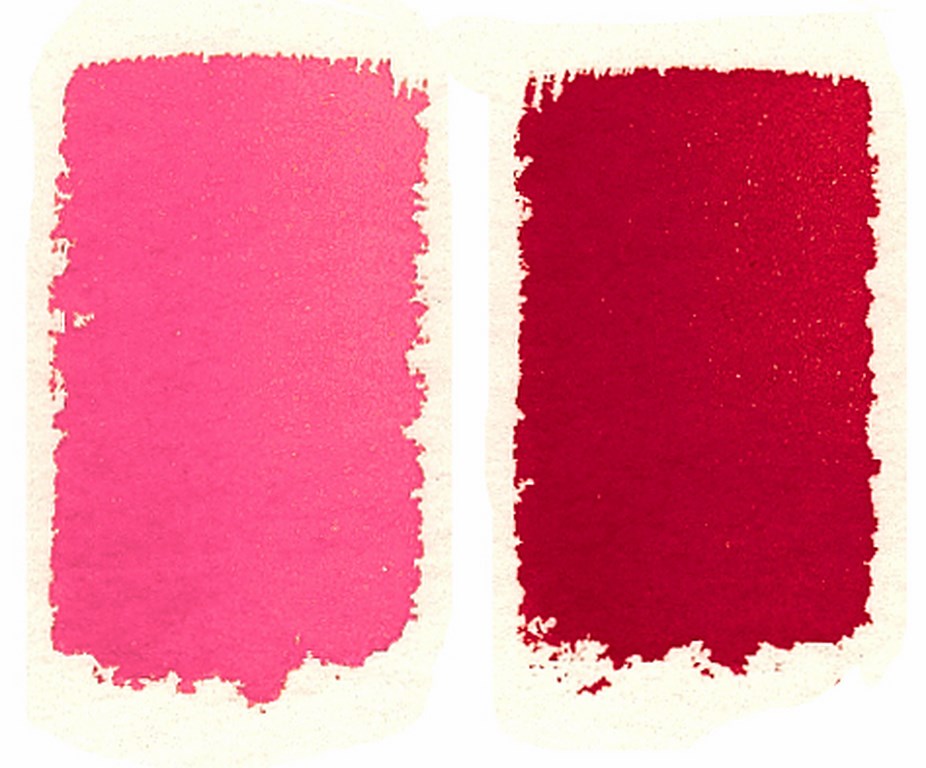
Value is the lightness or darkness of a color. This dimension has a range from white (or off-white) to jet black. When we observe values, we are seeing the amount of light reflected by a color, with lighter values reflecting more light and darker values reflecting less light (Figure 1).
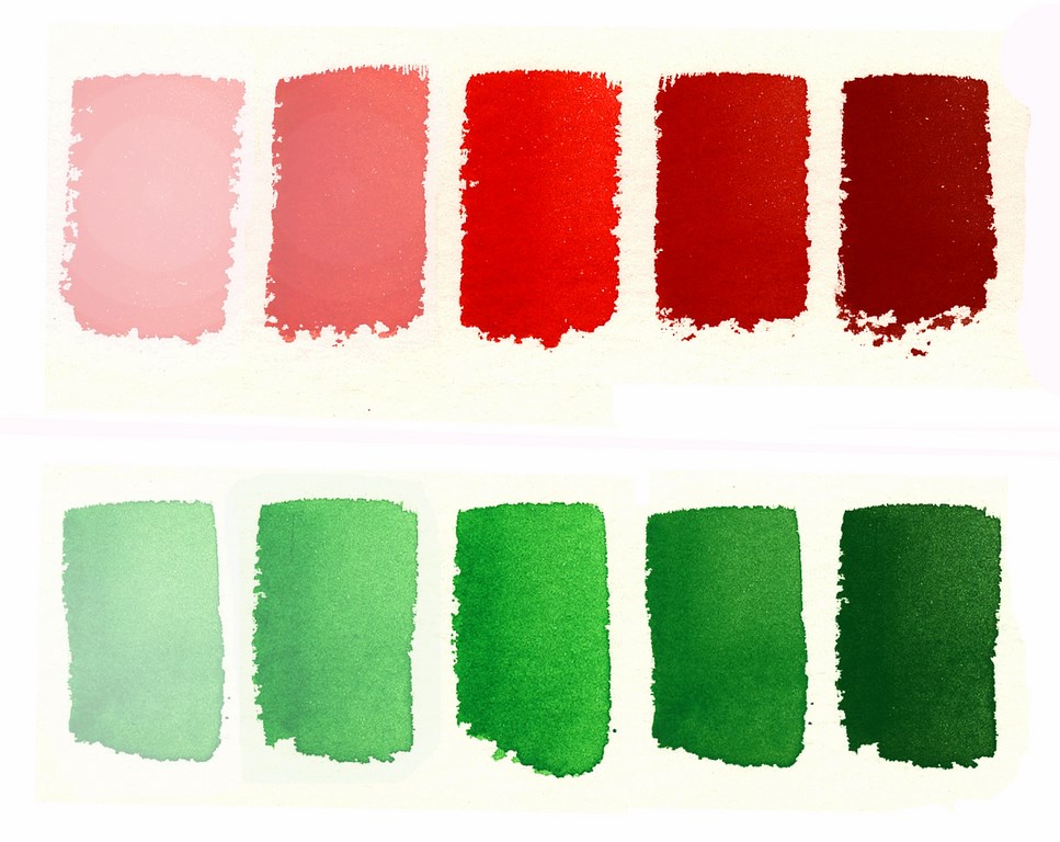
| Figure 1: Value scale for red and green. |
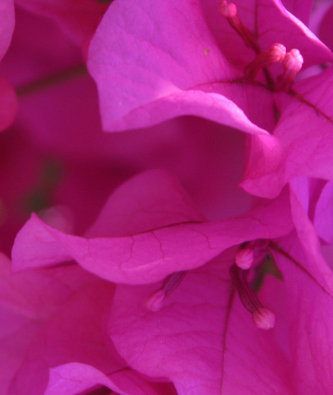
Every hue has a value range, from light to dark. For example, a red can appear soft pink (a lighter value) or deep burgundy (a darker value). In Figure 2 (below), the hue and temperature are the same – cool red. The only difference is in the amount of light reflected. This is what produces the light and dark values.
Value is a critical dimension of color – just as important as hue – although fewer designers take full advantage of this dimension today. For their part, artists of the Renaissance period focused primarily on the value dimension of color to make their paintings look three-dimensional, realistic, and emotionally compelling. When we design with values in the landscape, the possibilities are similarly exciting.
| Figure 2: Light and dark values in landscapes (left and right, respectively). |
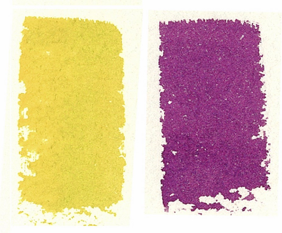
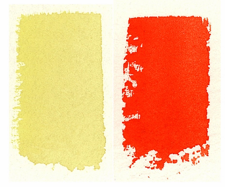
The third dimension of color is intensity – that is, the brightness (spring green, for example) or grayness (olive green) of a color – and has a range from bright to almost neutral gray (Figure 3). Intensity can also be referred to as chroma or saturation. Whichever term is used, it refers to the purity, brightness or strength of a color.

| Figure 3: Intensity scale for blue and orange. |
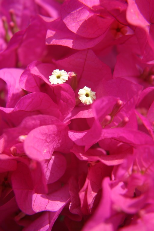
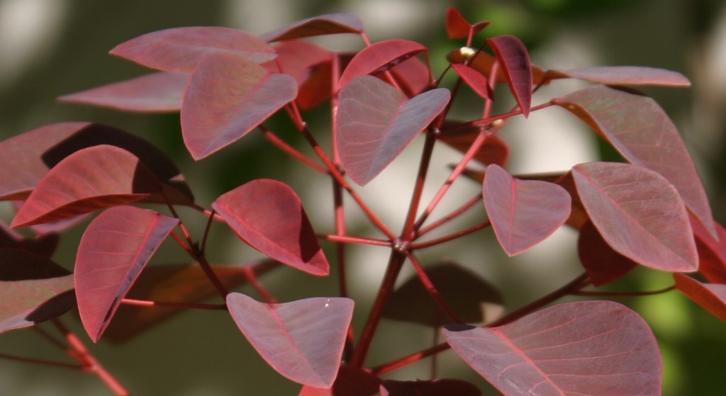
Every hue has an intensity range from bright to gray. The bract of a San Diego Red Bougainvillea, for example, is a boldly intense warm red, while an old brick tends to be a grayer warm red (Figure 4, below). Interestingly, both objects in this example are the same hue (and hue temperature) and have approximately the same value. The main difference is in the intensity.
(Here we are discussing the “local color” of objects – an object’s color when seen at close proximity in clear light. Atmospheric factors – distance, the color of daylight at different times of the day, whether the object is seen in full sunlight or shade, the presence of haze or fog and other factors – can greatly influence how we perceive color.)
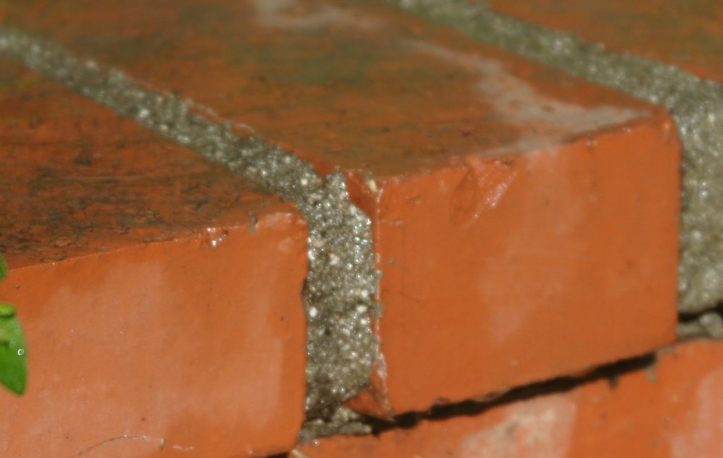
| Figure 4: Warm reds in Bougainvillea ‘San Diego Red’ and an old brick. |
If you observe nature, you will find that most colors in the landscape are not intense and pure, but are more gray and neutral (olive greens, brownish grays and other dull colors). In these landscapes, bright, intense colors tend to be limited to specific areas that attract our eyes. With the exceptions of, say, a Vermont forest in the fall, or a valley of bright-yellow Poppies in the spring (and other beautiful examples of large-scale intense color displays), it is the neutral colors that tend to dominate our landscapes.
COLOR WHEEL EXPANDED
When you add these two dimensions of color to the standard-hue color wheel (Figure 5), there are dramatic consequences.
If we add intensity to the color wheel, it immediately becomes more complex (Figure 6). As seen in this diagram, the most intense colors are located toward the outer edge of the wheel. As we move closer to the center, colors get progressively grayer as they mix with other colors.
When we add value to the color wheel, it transforms into a spherical shape that is most often referred to as a color sphere or color solid. The top of this spherical shape is where the lightest values are found, while the darkest values are located at the bottom (Figure 7). Accurately illustrated, the color solid is not truly a sphere, but is instead a complex three-dimensional shape. To learn more, one of the best available books is The New Munsell Student Color Set by Jim Long and Joy Turner Luke (2nd Edition, Fairchild Books & Visuals, 2001).
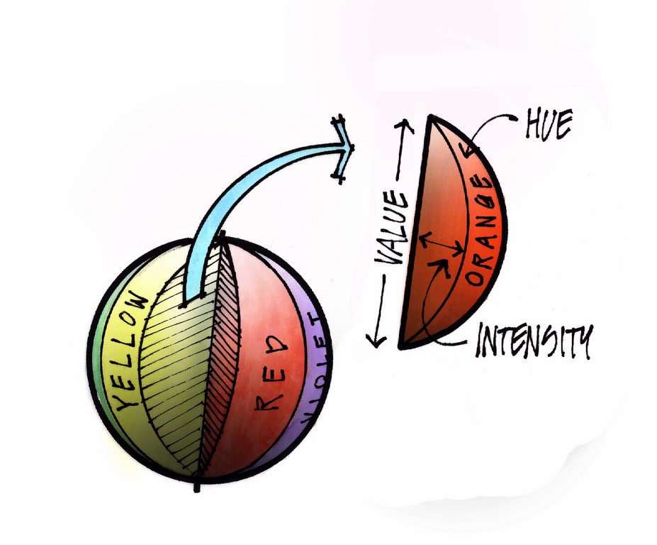
| Figure 5 (left): A color wheel with hue only. Figure 6 (middle): A color wheel with hue and intensity. Figure 7 (right): A color sphere/color solid with hue, intensity and value. |
These two tools – the color wheel and the color sphere – are most helpful in allowing us to simplify and organize colors as we plan and design with color.
Now that we’re familiar with the three basic dimensions of color (hue, value and intensity), we can define several key color concepts: color contrast, complementary colors, analogous colors and color harmony. These are concepts you will apply each and every time you design with color – very much worth remembering.
[ ] Color Contrast. The word contrast means “dissimilar” or “degree of difference” and is something you can apply in any or all three dimensions of color. As a designer, however, you tend not to work in absolutes. Instead, you will use varying degrees of contrast to design attractive color compositions, add excitement to your designs and attract the viewer’s eye to specific locations in the garden.
Working with value, for example, you can place a dark color against a light color. With intensity, you can place a bright, intense color against a grayer color. Or with hue, you can place one color against its complementary color (as explained below).
[ ] Complementary Colors. Some designers use the term complementary color to mean colors that look “nice” together – a wholly subjective use of these words. But in the context of color theory, complementary color has a specific meaning – that is, these are colors that are opposite each other on the color wheel. If the word contrast means “dissimilar” or “degree of difference,” the highest possible degree of contrast with any single hue is that hue’s complementary color (Figure 8).
Simply stated, the hue “red” will give you the greatest contrast when compared to the hue “green” – therefore red and green are complementary colors, as are blue and orange, or yellow and violet. Stated another way, red is the most opposite from green possible and green is most unlike red in that they share almost no color wavelengths (as discussed in the May/June article linked above). As you move around the color wheel away from green and toward red to reach yellow and then orange, each color gets redder because each color reflects progressively more red wavelengths.
The good news is we don’t need a color wheel to find a color’s complement. In fact, there’s an easy way to find a color’s complement based on what we learned in the last article about the color wheel and its basis in the three primary colors – red, yellow and blue. To find the complement of any single color (red, for example), simply mix the other two primaries (yellow and blue) to form green, which is red’s complement. Similarly, to find the complement of yellow, mix the other two primaries (red and blue) to form violet, the complement of yellow. Blue’s complement is found in the mixture of red and yellow (Figure 9).
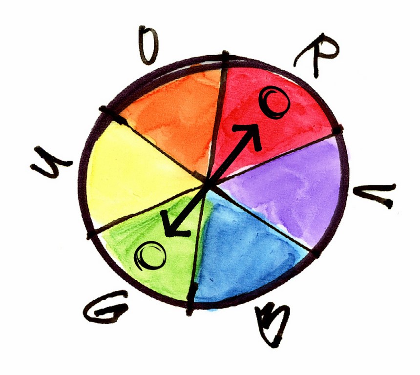
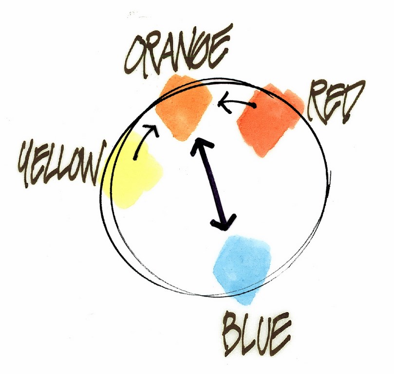
| Figure 8 (left): Complementary colors green and red on a color wheel. Figure 9 (right): Keys to memorizing complementary colors. |
In terms of temperature, the complement of a warm color is always a cool color and vice versa. Therefore, the true complement of a warm green would be a cool red, while the complement of a cool yellow would be a warm violet, and so on.
As to applying this knowledge in the field, let’s say you are called out to select flowering perennials for a plaza. When you arrive, you study the colors of the space and see that the dominant colored material is the sandstone paving of the plaza floor. The sandstone has an obvious warm-orange color.
What color (hue) will create the greatest contrast and impact? That will be the complementary color to orange – that is, blue. The orange paving is a visual combination of red and yellow, and blue is its complementary color. With that in mind and if your aim is to create a lively contrast, you could select perennials that display a cool blue flower to complement the dominant warm-orange color of the paving.
Beware: This example does not imply that a formulaic approach will work in all cases. This is simply one example of how you might apply this idea in a landscape.
[ ] Analogous Colors. In the context of our study of color, analogous means “similar.” If a complementary color is an example of high contrast, then an analogous color is an example of lower contrast.
The color wheel shows us analogous colors as well as complementary colors. Simply look for the colors that are adjacent or near other colors: The analogous colors of red, for example, are orange or violet, while the analogous colors of green are blue and yellow.
You use both complementary and analogous colors strategically when you design. In a landscape, for example, focal points are excellent areas for use of complementary colors (the high contrast will attract the viewer’s eye), while surrounding, supporting areas are good locations for analogous colors (where lower-contrasting colors will not compete for attention).
[ ] Color Harmony. In design presentations, I have heard the phrase color harmony used to describe a color combination that looks “pleasing” – another subjective use of a valuable term. For us, a more specific description is needed.
Although many artists and designers scoff at the idea that color harmony can be defined in any formulaic way (and I agree), I have found that, whenever we design with two or more colors, color harmony can be better understood and achieved by consciously focusing on the three dimensions of color – and by adjusting one or more of these dimensions to strike a balance between similarity and contrast in a way that creates a positive emotional response. This is about as sure a way I know of to better understand why some colors seem to appear attractive together and others do not.
Let’s look at the three combinations of color swatches in Figure 10: In the first (left), these colors look good together to my eye because they are similar in hue and intensity but contrast in value, forming a nice balance between similarity and contrast. In the second (middle), these colors also work well together because they are similar in intensity but contrast in hue and value – again, a nice balance of similarity and contrast. In the third example (right), however, the two colors clash: Everything contrasts, and there is no similar (unifying) dimension of color – no balance and no harmony.
| Figure 10: Colors in harmony (left and middle); colors that do not harmonize (right). |
The key statement above – “in a way that creates a positive emotional response” – is about the importance of experimenting. You must experiment with multiple combinations of colors until you, the designer, feel a positive response from the composition in front of you. The experimenting is the key, and when you approach it in a sequential manner, focusing on each of the three dimensions of color, you can be sure your results will be attractive, that they will harmonize and that you will know why.
NEXT STEPS
We now have a basic understanding of key color concepts. In future issues of LandShapes, other landscape professionals will address issues of color theory in their columns and articles (whether it’s their specific subject or not) and will further our study of color by applying color theory directly to landscapes in many beautiful and different ways.
Every landshaper works with color on an almost daily basis and has some sense of color, even if that knowledge can’t be expressed in the formal terms I’ve used in this introductory series. This means that many voices will be adding their expertise, sharing design processes and depicting work that will advance our collective appreciation of color, how it works and, on occasion, fails to work in built environments.
Enjoy and observe the colors of nature around you, experiment with what you’ve learned here about color and begin to find opportunities to apply that knowledge in your own landscape designs. Above all, have fun!
Richard E. Scott, ASLA, ASAI, is a teacher, landscape architect and architectural illustrator in the landscape architecture department at California State Polytechnic University in Pomona and offers workshops in color theory and sketching for landscape designers. His renderings have appeared numerous times in Landscape Architecture magazine, Los Angeles-area newspapers and books on architectural design and rendering, and his landscape design work has been featured on National Public Radio station KCRW in Santa Monica, Calif. His projects have included rendering work for the University of California, the J. Paul Getty Museum, George Lucas and Christopher Alexander (author of A Pattern Language) as well as design work for Donald Trump, UCLA, the City of Los Angeles and the ABC Network Studios. His workshop schedule can be viewed at www.graphicsteacher.com.