


Wall Wonders
 Elegance, romance, subtlety, tranquility: All these words speak to a potential of watershaping that is realized far too infrequently.
If ever there were a common detail that typifies these missed opportunities, I’d have to give the prize to the standard waterfall/waterwall effects seen on too many pools and other watershapes these days. I can think of nothing less compelling than the typical sheet of water spilling down the face of a wall or in front of some other structure on its way into a pool or spa. This look is not only overused, but misused as well.
This happens, I think, because too many watershapers approach these flows as easy bells or whistles to add onto projects (with nice profit margins attached) rather than as fundamental design decisions – decisions that in large measure will dictate the way these watershapes will be perceived forever by homeowners and their guests.
I’d argue that this indiscriminate, bottom-line-oriented approach is a negative impulse that tends to result in work that is often uninspired, sometimes awful and almost always lacking in creative spark. It’s a shortcoming in vision we collectively need to address.
PROPORTIONAL EFFECTS
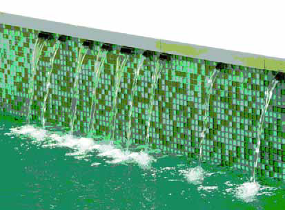
What you usually see in the field are knife-edge weirs that are simply too big relative to the structures they are asked to adorn.
Water in motion draws far more attention than does a motionless wall, so when you dedicate a large percentage of, say, a raised bond beam to a three-foot-wide weir pouring a sheet of water, all you see is the water because it’s out of proportion to the rest of the structure. You can use the most beautiful finish materials in the world, but all anyone will ever perceive is the outsized water effect – which means the client wasted money on whatever tile, stone or other finish is going unnoticed behind and around the sheeting water.
In addition to problems of proportion, there are also issues of balance related to the fact that, to many people, “balance” means “symmetry.” In design terms, the odd thing is that setting things up symmetrically is often the best way to create imbalance in a composition. In knowledgeable hands, that can work effectively, but for the most part it a short path to visual conflicts.
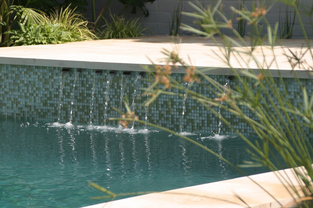
| In my last few columns, I’ve used this project to exemplify nice ways to handle transitions between materials. This time, I’m calling out the project’s asymmetrical line of wall spouts – small flows relative to the hardscape mass that contains them that lend motion to the setting without disrupting visual balance in the way a sheeting waterfall would. |
As a rule, designing with asymmetrical flows of water that are small relative to the size of a hardscape structure will create a more balanced composition and represents a better use of the visual power of water in motion.
A related problem is that too many watershapers position sheeting water effects too high above the water’s surface. Depending on the flow rate, when water falls more than two or three feet, the sheet will start breaking up, creating a ragged look at the bottom. Moreover, as it falls, the sheet tends to narrow relative to the weir above in what I call the “tubular effect” (if any of you know what this is really called, please let me know!). Both these behaviors result in a sheeting water effect that isn’t really “sheeting” and never looks its best.
Confronted by this narrowing, broken appearance, lots of watershapers try to compensate by increasing flow over the weir. Yes, that might address a shortcoming in the appearance of the waterfall, but it has the greater effect of throwing things even more out of proportion. To me, there’s nothing attractive about a three-foot-tall wall that has a wide, knife-edge waterfall spewing water out two feet onto the surface of a pool or spa. It’s horribly out of balance.
It also represents a broader-scale assault on the clients’ senses: Not only are the visuals bad, but the flow of water that comes out of these weirs is so vigorous that, in any small space, it’s like standing next to Niagara Falls. The flow stops being soothing background noise and instead is like sitting next to a freeway.
And don’t get me started about the ways in which some of these weirs are installed. All too often, they’re out of level, which means the flow must be boosted simply to keep one edge or the other from running dry.
INDUSTRY INSPIRED
It’s bad enough that many projects suffer from one or two of these design-related problems, but all too often projects run the table with waterfall effects that are complete visual, aural and functional disasters. And this isn’t just an affliction with low- or mid-range pools: What amazes me is how frequently this cluster of errors afflicts high-end pools and that clients are asked to pay big bucks for what can only be described as aesthetic failures.
The same set of issues applies, of course, to basic spa-dam spillovers and raised spas. In most cases, concerns arise about proportion, scale, balance and ragged water flow. In too many cases, the errors stick out like sore thumbs – and these aren’t dismissible as being “matters of taste”: Anyone with eyes can spot functional shortcomings that only serve to bring poor aesthetics into clear focus.
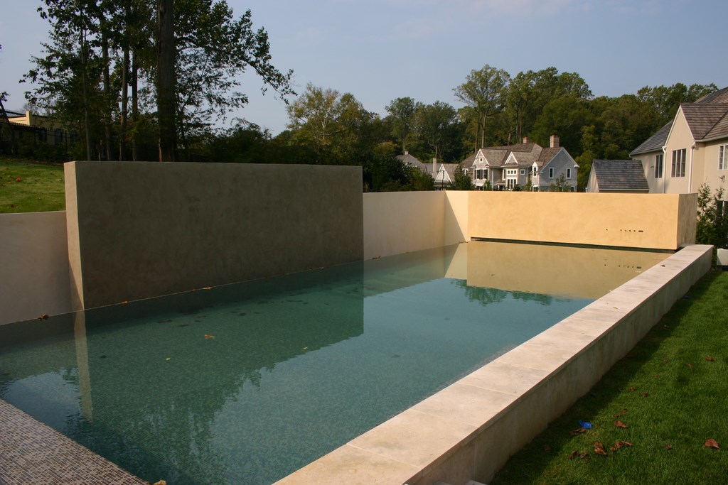
| In this application, the wall spouts would be almost invisible if it weren’t for the shadows they cast on bright, sunny days. Their main impression is made when the water comes and serves to soften the walls’ big visual planes, lend a gentle noise to the yard and bring a sense of motion and energy to the large water surface. |
Too often, and especially on lower-end projects, these waterfall effects assault the eyes, but they also gush and roar so loudly that you can’t hear yourself think. Yes, they help build the bottom line, but at what cost to homeowners and, ultimately, the reputation and future of the watershaping industry?
A couple years back, my observation of these issues led me to develop TishWays – sets of weir components that could be used to achieve consistently better results in spillover design. The system generates small flows of water that replace gushing overflows, and I’ve been pleased to see other designers and builders adopt and apply the system (available from Oreq of Temecula, Calif.) in their projects. It’s flattering, of course, but it also gives me hope that some of what I’ve been saying about design in these columns is having some effect.
Soon, I will be introducing a second, related system, as yet unnamed, that will serve the same sort of purpose for wall rather than spillway applications – let’s call them WallSpouts for now.
The idea is simple: Instead of total reliance on often-clunky sheets of water, designers will have the option of using small weir components that can installed in just about any vertical surface to create small water flows that will almost always be much more to scale and proportion. This may seem basic, but it’s a plain fact that watershapers can use any tools that will help them get things right.
I’d love to take full credit for this concept, but this is hardly a new idea. Some of master architect Ricardo Legorreta’s massive walls are highlighted by flows of water from large, perfectly proportioned spouts, for example. But my main inspiration here is probably painter Piet Mondrian, whose compositions of white and colored rectilinear shapes in black frames speak volumes about proportion, balanced masses and the creation of compelling visual planes.
MASTER PRACTITIONERS
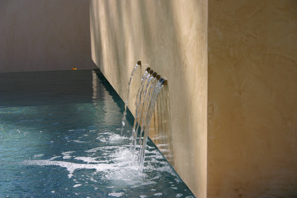
The WallSpouts system consists of small boxes to be mounted in walls in any quantity desired – and not necessarily all at the same elevation. Each box provides a small spillway ranging in width from one to three inches. The weirs can be used in endless combinations and patterns across whatever wall surface is available – whatever it takes to achieve visual balance (which, by the way, is usually an asymmetrical visual balance).
The mechanics of these WallSpouts is not much different from any other wall-mounted weir fixture, involving mostly a plumbing connection to a reservoir and a spillway. One difference is that the new system will include niches for fiberoptic connections that will add subtle nighttime lighting effects to the mix.
What makes the weirs most useful is that they’re appropriately scaled to the parameters of most pools, spas and waterfeatures. Moreover, the fact that they can be installed in combinations gives the designer the ability to create all sorts of different, balanced looks. The weirs are made out of different materials (brass, copper, ABS, stainless or plated steel) to fit with a given look, and the outside of the box can be covered with any type of finish material (stone, plaster, concrete, tile or stucco).
The weirs are designed to protrude an inch to an inch and a half beyond the wall surface, depending on the finish material and the application, and are meant to be set no more than 18 inches above the water’s surface. They are small, so they’re barely noticeable when they’re not operating.
As seen in the photographs accompanying this text, I like using them as clusters at the bottoms of tall walls. As you can see, they don’t make big statements: The effect instead is one of understated elegance – far more artistic and pleasing to me than an oversized plastic box stuck haphazardly in a wall or raised bond beam that spews water into the void in a way that attracts a lion’s share of attention.
In all cases, although the moving water is definitely a key aesthetic element, it is not the main feature in the scene. Instead, it’s an accent – as it almost always should be.
David Tisherman is the principal in two design/construction firms: David Tisherman’s Visuals of Manhattan Beach, Calif., and Liquid Design of Cherry Hill, N.J. He can be reached at [email protected]. He is also an instructor for Artistic Resources & Training (ART); for information on ART’s classes, visit www.theartofwater.com.